
Vintage Calendar Design Ideas That Print Like the Real Thing


Five period styles, the color and halftone decisions behind each one, and the stock and binding that keep the look intact once it leaves the press.
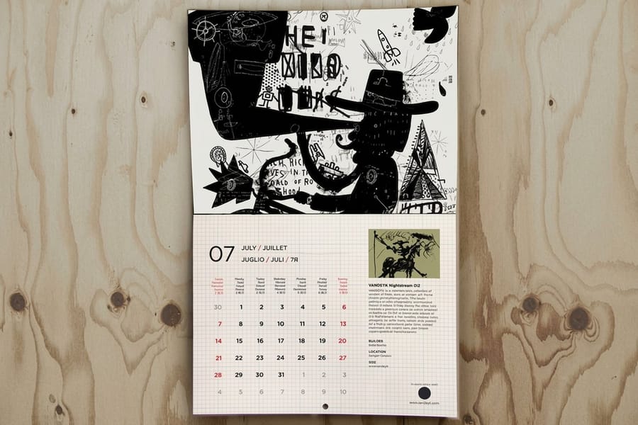
A calendar reads as vintage because of four decisions: a palette of two or three inks, a typeface that belongs to the decade you are copying, a halftone dot you can actually see, and a date grid with room to breathe. Print it on uncoated stock and bind it wire-o so the page lies flat, and the piece looks like the era rather than a filter applied to it. The dot has to be built into the artwork before upload, because a modern press screens too fine to show one.
Quick answer
Two inks, a visible dot, and a grid that stays readable
The retro look is a production style, not a decoration. Period calendars used two or three inks and built a third tone by overlapping them, screened images at a ruling coarse enough to see, set dates in plain numerals under a display month name, and printed on paper that showed its own surface. Copy those four things and almost any format carries it. Skip them and the piece looks modern with an old photograph on top, which is what most vintage attempts actually are.
Five Retro Calendar Styles and What Each One Needs
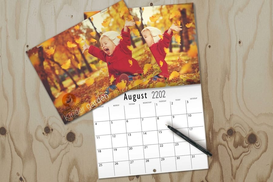
Vintage is not one style. Copying a 1934 almanac and copying a 1972 poster calendar pull in opposite directions, and mixing their cues is what makes a design read as generic rather than period. Pick one decade and commit to it.
| Style | Palette | Type | Art | Best format |
|---|---|---|---|---|
| Letterpress almanac | Black plus one red, no tints | Slab serifs and wood type condensed caps | Line engravings, ornaments, rules | Small wall or desk pad |
| Midcentury grid | Two or three flat colors, plenty of paper white | Geometric sans in a single weight | Abstract shapes, no photography | Wall calendar, large date grid |
| 1950s advertising litho | Warm four color with a coarse dot | Brush script paired with condensed grotesk | Illustrated figures, product still lifes | Wall calendar with a tall image panel |
| 1970s poster | Avocado, mustard, burnt orange, brown | Fat rounded display faces, tight spacing | Photographic collage or airbrush | Single sheet poster calendar |
| Victorian ephemera | Muted earth tones on cream | Multiple serifs stacked at different sizes | Engraved botanicals, decorative borders | Small format, heavy stock |
The midcentury grid is the easiest of the five to print well, because flat color on uncoated stock is forgiving and the layout leaves the date grid alone. The 1970s poster is the hardest, and not for design reasons: those saturated colors were mixed inks, and four process colors cannot reach them. The 1950s look sits in between, and it lives or dies on the halftone dot. If you are still choosing the shape of the piece, the standard calendar sizes guide covers wall, desk, poster and pocket dimensions before you commit a layout to one of them.
Getting the Color and the Texture Right

Old calendars look the way they do because of a production limit, not a taste. Ink cost money per plate, so most jobs ran two colors and the designer got a third tone by overlapping them. That overlap is the single most useful thing to copy.
Set up your file with a spot color and black, let the two overprint wherever you want depth, and you get three distinct tones from two inks. It also forces the restraint that makes the style work. The mechanics are covered properly in our guide to two color printing with Pantone and spot inks.
The second signal is the halftone. Presses in the 1950s screened at a coarse ruling and you can see the rosette from arm's length. A modern job screens fine enough to disappear, so if you want the dot you have to build it into the artwork. Convert the image to bitmap in Photoshop with a halftone screen somewhere around 25 to 45 lines per inch, then bring it back to grayscale or CMYK before placing it. Test one page at the size it will print, because a dot that looks charming on screen at 200 percent can look like a mistake at full size.
Faked misregistration is the third trick, and the one people overdo. Offset a color plate by half a point to a point, apply the same offset consistently across the piece, and never apply it to type below about 10 point. Random offsets in different directions do not look like a press that drifted, they look like a file that was built badly. A word of caution on color mode: sample your palette in CMYK rather than eyedropping an RGB scan, because the richest period colors sit outside what process inks reach. Our note on CMYK against RGB for printing explains where the gap opens up.
Type and the Date Grid, Where Most Retro Calendars Fall Apart
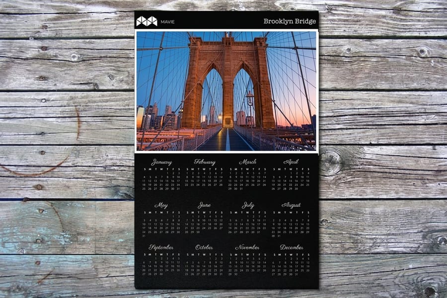
A calendar has a job before it has a style. Someone has to read a date across a room, and the retro treatment has to survive that. Three rules keep the two from fighting.
- Six rows, always. A month that starts on a Saturday runs into a sixth week. Build the grid with six rows from the start and let the empty one sit blank rather than redrawing the page in October.
- Period display type, neutral date numerals. Put the fat 1970s face on the month name and the year. Set the dates in something plain and evenly spaced. Numerals in a heavy display face at 14 point become a puzzle from four feet away.
- Weekday labels earn their space or go. Three letter abbreviations in caps at a small size work. Full weekday names squeeze the columns and push the numerals off center, which is what makes an amateur grid look crooked even when it is not.
On the image panel, period art wants around 40 percent of the page height. Less and the calendar looks like a spreadsheet with a picture stapled to it. More and the grid gets cramped, which is exactly what the style was never about. If you want the full page setup rather than the styling decisions, the wall calendar design guide walks through bleed, page order and the month sequence, and there are correctly sized layouts waiting in the blank template library.
One more thing that gets missed: a vintage calendar usually carried a small piece of information alongside the dates, whether that was moon phases, holidays or a farm almanac note. Adding one authentic extra column of information does more for the period feel than another ornament. The six components of a custom calendar covers what belongs on the page and what does not.
Stock and Binding for a Calendar That Feels Period
The paper does half the work here, and it is the half people skip. Uncoated stock lets ink sink in slightly, which spreads the edge of every halftone dot and gives type the soft outline that old presses produced by accident. Coated gloss does the opposite: it holds the ink on the surface, keeps every edge crisp, and makes a period illustration look like a magazine reproduction of one. Matte coated sits between them and is the sensible pick if the calendar has to carry modern photography as well as retro art. The full comparison is in our paper stocks guide.
Weight matters differently on a wall calendar than on a brochure. A hanging page has to stay flat against the wall for a month without curling at the corners, so a heavier cover stock on the front and a solid text weight inside beats a uniform light sheet. Ask for the available stock list in the configurator on Standard Calendars before you settle the design, because a look built around uncoated cream will not survive being switched to gloss at checkout.
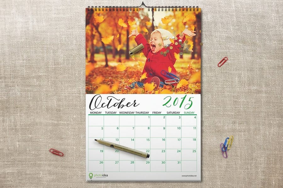
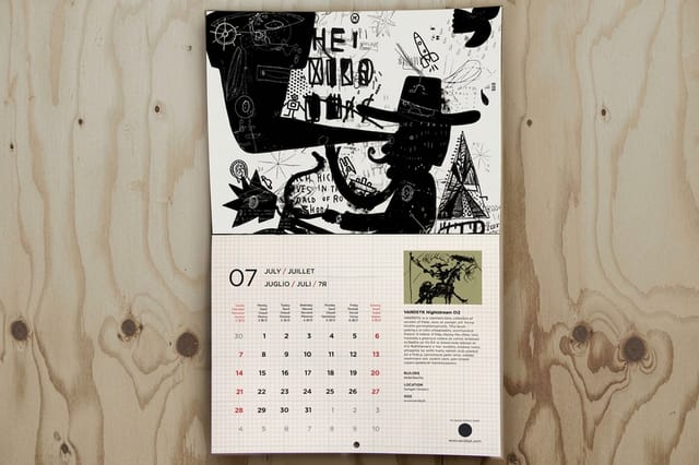
For binding, wire-o is the format that suits a retro wall calendar and it is what Wire-O Coil Calendars are built around. The metal coil lets a page turn fully back on itself and lie flat, the loops give you a hanging point without a separate hole, and the pages stay square instead of bowing the way a saddle stitched book does. The cost is the punch band. Holes and coil take roughly the top half inch of the sheet, so extend background art into it and keep the month name, any rules and every scrap of type below the line. Both Standard Calendars and Wire-O Coil Calendars open at $812.59 in the configurator, so the coil binding itself is not what moves the number. If binding options in general are new to you, the binding types guide is the wider reference.
Not every retro calendar has to be a twelve page book. A single sheet year planner in the 1970s poster style prints as a Standard Poster from $108.75 and hangs with two pins, and a small monthly design works as a Standard Magnet from $19.68 for something that lives on a fridge door. Both are cheaper ways to test a palette before committing to a full run. The rest of the range sits on the calendar printing category, and bulk calendar ordering covers what changes when you are printing for clients rather than for one office.
Wally explains the retro calendar
Two inks, a dot you can see, and nothing in the punch band
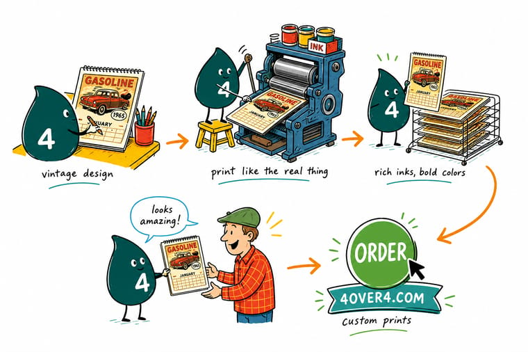
Wally mixes one spot color with black and lets them overlap, which hands him a third tone for free. He screens the picture coarse enough that the dots show, sets the month name in a period face and the dates in something plain, then draws six rows because September insists on a sixth week. Last, he keeps every scrap of type out of the top half inch, because that is where the wire-o coil goes and the coil does not read.
Order wire-o coil calendars →Specs and pricing
Calendar formats, sizes, and starting prices
Compare the formats a vintage design can live on, with live configuration choices and starting prices straight from the 4OVER4.COM configurator.

Print it
Print the retro calendar you designed

Explore more
Where to go next


By the numbers
Wall calendars, coil bound and poster style
Common Questions
Your vintage calendar questions, answered
What actually makes a calendar look vintage instead of just old?
Restraint in the palette and honesty in the texture. Period calendars were printed with two or three inks because a full color run cost real money, so the designer built depth by overlapping those inks instead of reaching for a fourth. Add a visible halftone dot, a typeface that belongs to the era you are copying, and paper that shows its own surface, and the piece reads as vintage before anyone looks at the dates. Sepia tinting a modern photograph does none of that and everybody can tell.
How do I get a real halftone dot rather than a smooth gradient?
Build it in the file. Convert the image to grayscale in Photoshop, then use Image, Mode, Bitmap with the Halftone Screen method and a frequency somewhere around 25 to 45 lines per inch depending on how obvious you want the dot. Convert back to grayscale or CMYK before you place it. Do not ask the printer to run a coarse screen for you, because a modern press is set up for a fine screen you are not meant to see, and the coarse effect has to exist in the artwork you upload.
Which stock suits a retro calendar best?
Uncoated, if the configurator offers it for the product you pick. Uncoated paper absorbs a little ink, which spreads each dot slightly and gives type a softness that matches old work. The trade off is that solid color looks a shade duller and photographs lose some snap, so if half your calendar is modern product photography and half is period illustration, a matte coated stock is the safer compromise. Our guide to printing paper stocks explains how each surface behaves with ink.
Do saturated 1970s colors print accurately?
Often not, and this is the most common disappointment. If you sample an avocado green or a burnt orange from an RGB scan of an old calendar, the screen shows a saturation that four process inks cannot reach, and the printed result comes back duller than the sample. Pick those colors in CMYK from the start, or specify them as spot inks if the product supports it, and judge them from a printed proof rather than a monitor.
Is wire-o the right binding for a vintage wall calendar?
For a hanging monthly calendar, yes. Wire-o lets the page lie completely flat against the wall and turn back on itself without straining the spine, and the loops give you a natural hanging point. The catch is the punch zone: the holes and the wire occupy roughly the top half inch of the sheet, so anything you care about has to sit below that line. Saddle stitch is cheaper but the pages bow away from the wall, which ruins a flat period illustration.
Can I use scanned artwork from an old calendar I own?
Only if you own the rights or the work is in the public domain, and that is a copyright question rather than a printing one. On the technical side, scan at 600 ppi rather than 300 if the original already carries a halftone dot, because scanning a dot pattern at low resolution produces moire, a visible interference grid that gets worse when the file is screened again on press. Descreen in the scanner software, then rebuild the dot deliberately at the size you want.
Get Started
Standard calendars run 25 for $812.59, or $32.50 each
Pick the format, choose your stock, and we print a calendar that lies flat on the wall with the dot, the palette and the grid exactly as you built them.
Legal Disclaimer
Gold Standard guarantees apply to all standard orders placed through 4over4.com. Price match requires verifiable proof of a competitor's published price for an equivalent product with matching specifications and turnaround time. Satisfaction guarantee covers manufacturing defects and print quality issues. Contact support with order number and documentation. On-time delivery rate based on tracked orders 1999 to 2026. Individual results may vary based on shipping carrier performance.
