
The Brand Evolution System That Keeps Creators Recognizable


Three layers, three different clocks. What to lock for years, what to review every two, and what you can change every week without making your audience learn you all over again.
A brand evolution system sorts your brand into three layers and gives each one its own change clock: the core holds for five years or more, the identity system is reviewed every two, and the surface changes every time you publish. Most creator rebrands go wrong because they move the middle layer to solve a problem that was living in the top one. Sort the complaint first, print a short test run before you commit, then overlap the old and new marks for a quarter instead of flipping a switch.

Quick answer
Three layers, three clocks, one review date
Recognition is carried by the two slowest layers of your brand, so those are the two you protect. The core, meaning your name, your audience and your point of view, should survive five years untouched. The system, meaning the logo lockup, type, palette and tone, gets a scheduled review every two years that usually ends in three small corrections rather than a redesign. The surface, meaning thumbnails, campaign art, packaging graphics and merch drops, is supposed to move constantly. Write the review date down, and your brand decisions stop being reactions.
The Three Layers, and Which One Your Problem Lives In

Every brand is three layers stacked on top of each other, and each layer runs on its own clock. Sorting a complaint into the right layer is most of the work, because the fix for a surface problem is a week and the fix for a core problem is a year.
| Layer | What it holds | Change clock | What breaks if you rush it |
|---|---|---|---|
| Core | Name, the audience you serve, the thing you argue for, the promise you keep. | Five years or more. | Recognition resets. Old followers treat you as a new account and search history stops helping you. |
| System | Logo lockup, typeface, palette, photography treatment, tone of voice. | Reviewed every two years, redesigned far less often. | People stop recognizing you at a glance, and every printed and physical asset you own goes out of date at once. |
| Surface | Thumbnails, campaign art, seasonal packaging, merch drops, launch graphics. | Constant, every publish. | Almost nothing. This layer is meant to move, and a stale surface is what makes a healthy brand feel old. |
Run the sort out loud. When someone says the brand feels tired, ask which layer they are actually describing. If they point at your thumbnails, your identity is fine and your art direction is stale. If they say they could not tell your last three posts apart from anyone else’s, that is a system problem. If they cannot say what you stand for, the core is unfinished, and no palette will rescue it.
The distinction between what you say and how you look is worth reading properly, because most creators conflate them. Our guide on the difference between marketing and branding draws the line, and brand messaging explained covers what belongs in the core before you spend anything on design.
The Signals That Say Evolve, and the Ones That Only Say Bored
You are allowed to be bored of your own logo. You are not allowed to redesign because of it. Boredom arrives roughly eighteen months before an audience notices anything, which is why creators who follow the feeling end up changing the system layer twice as often as they should.
Real signals that the system layer needs work:
- The mark fails somewhere you now publish. It disappears at 48 pixels, it collapses in a circular avatar crop, or it cannot be reversed out on a dark background without an outline.
- The palette breaks on a real substrate. A screen color that sings on an OLED panel can print flat and dull on uncoated stock, and if half your output is physical that is a genuine constraint.
- You have quietly stopped using the identity. Three different fonts across your last ten pieces means the system already failed, and the redesign is just paperwork catching up.
- The audience shifted underneath you. A palette and voice built for one crowd rarely fits the crowd you have five years later.
- Something concrete blocks you: a trademark conflict, a marketplace that rejects your file, a partner whose brand you now sit next to.
Now the cost, because most guides skip it. Every move in the system layer forces the audience to learn you again. Recognition is built from repetition, and you are deleting some of that repetition on purpose. Expect a period where people scroll past work they would have stopped for, and expect it to last longer if a large share of your traffic comes from search or a marketplace, where thumbnails, listings and packaging all update on different schedules and briefly disagree with each other.
That trade-off is exactly why the review is scheduled and the redesign is not. Work through the brand refresh checklist at each review, and if the mark itself is the weak point, test it against the principles of logo design before you commission anything new.
Run the Evolution as a Six Week Sprint
An evolution that lives in a moodboard never ships. Give it a fixed shape and a fixed end date, and keep the whole thing small enough that being wrong costs you a fortnight rather than a quarter.
Week one, sort and write. Put every complaint into a layer. Write the core down in five sentences: who you serve, what you promise, what you refuse to do, the one word you want people to use about you, and the thing you will still be saying in three years. If that page is hard to write, stop. The problem is not visual.
Weeks two and three, draft two directions. Two, not six. One that keeps most of the current system and corrects what fails, and one that pushes further than you are comfortable with. The comfortable option usually wins, but only after the bolder one has shown you where the ceiling is. Build both at the sizes you actually use, including the avatar crop and a business card, not on a giant white artboard.
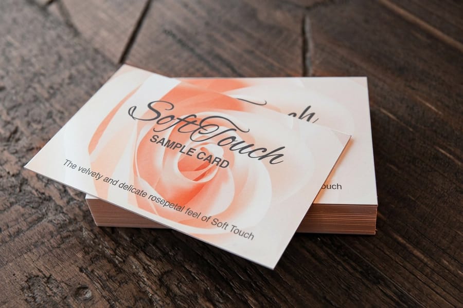
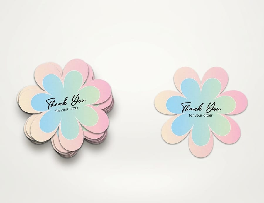
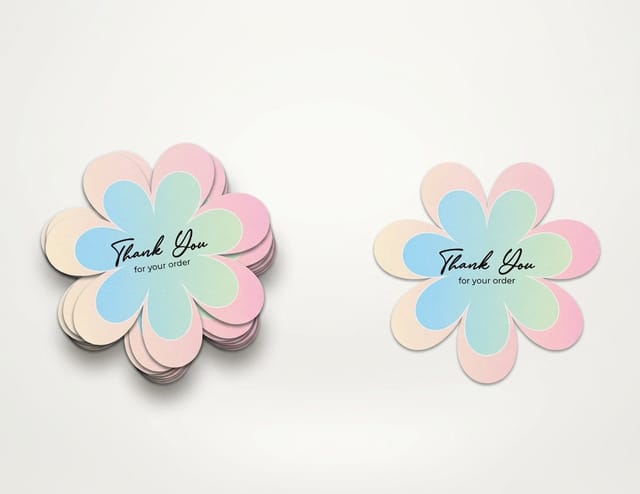
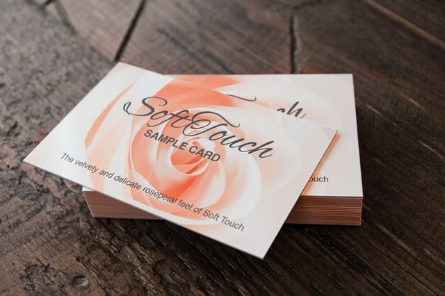
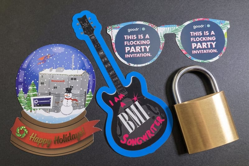
Week four, print the smallest real run. This is the step creators skip and regret. Screens flatter everything: they backlight your color, they hide muddy contrast, and they never show you what happens at 3.5 by 2 inches. Standard business cards start at $17.57, so both directions can be printed and carried around for the price of a couple of coffees. Standard postcards from $16.48 give you a larger canvas to check how the type and photography behave together, and die-cut stickers from $93.37 tell you whether the mark still reads once it is cut to its own outline, which is the harshest test a logo gets. If the finish is part of the idea, soft touch business cards at $40.28 show what a matte laminate does to the same artwork.
Week five, put it in hands. Give the printed pieces to ten people who will tell you the truth, and ask one question: what do you think this person does? Do not explain the concept first. If the answers cluster, the system is working. If they scatter, the core sentence is not landing and the design cannot fix that.
Week six, decide and document. Pick one direction, write the rules on a single page, and set the next review date two years out. Start from a correctly sized layout in the blank template library, or build the artwork directly in the online design templates if you do not have a designer on the project. When you are ready to order the real quantity, the business card printing range lists every stock and finish with live pricing.
Rolling It Out Without Losing the Audience You Have
A rollout is a sequence, not a launch day. The goal is that nobody has to work out whether they are in the right place, which means the two identities live together for a while and the old one leaves quietly.
Change the places you control and check daily first: profile images, site header, email signature, the top of your shop. Then the places people find you but you rarely open: marketplace listings, directory profiles, guest bios, the footer of an old lead magnet. Physical stock goes last, and it goes as it runs out. A box of cards with the previous mark handed over during the overlap reads as continuity, not sloppiness.
Two things get retired immediately rather than gradually: anything printed with a URL or handle that no longer resolves, and anything quoting a price you no longer charge. Those cost you money on contact. Everything else can age out.
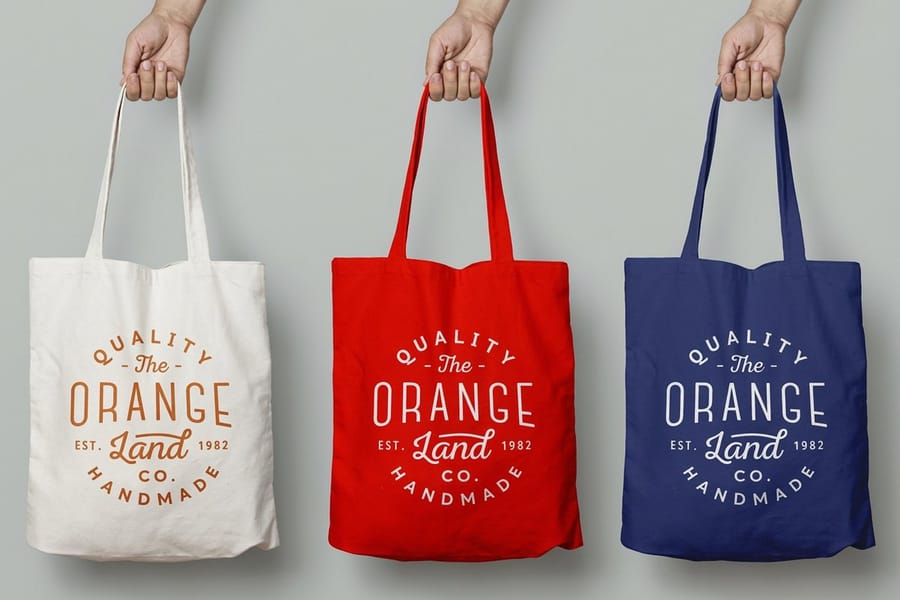
Merch is the last layer to move, because it carries the longest lead times and the largest minimums. Wait until the new mark has survived a full quarter in public before you commit it to apparel or packaging. When you do, keep the first drop to the items people actually use in front of other people. Tote bags from $22.73 and a sticker run from the sticker printing range put the new mark into circulation without a warehouse of stock you might regret. Our guide to branded merch that works covers which items get kept and which get binned, and if you sell online, ecommerce branding deals with the storefront and packaging side of the same rollout.
The One Page That Keeps the System Alive
A brand book nobody opens is worth nothing. What survives is one page that a collaborator can read in two minutes and follow without asking you a question.
Put five things on it. The core in five sentences. The logo lockup with a clear space rule and a minimum size in both pixels and inches, because the inch figure is the one that saves you on print. The palette with hex, CMYK and Pantone values, so nobody guesses at a conversion when a job goes to press. Two typefaces with the weights you actually use, not the full family. And a short do-not list, which is usually the most useful part: never stretch the mark, never place it on a photograph without the solid version, never use the accent color for body text.
Add the review date at the top of the page. That single line is what turns this from a document into a system, because it means the next decision about your brand happens on a schedule rather than at midnight after seeing someone else's rebrand. Choosing colors that survive both a screen and a press is its own skill, and our guide to brand color combinations that work in print is a good place to test your palette before it becomes law.
Wally explains brand evolution
Three trays, three clocks, and only one of them moves fast
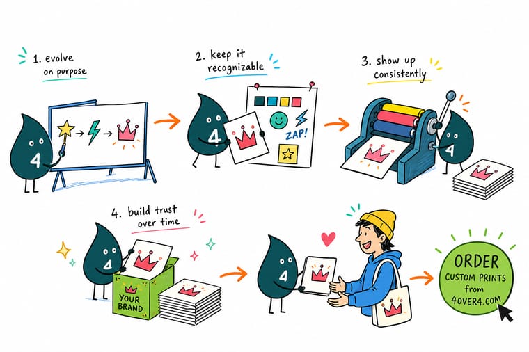
Wally keeps three trays on the counter. The bottom one holds the name and the promise, and he opens it about once every five years. The middle one holds the logo, the type and the colors, and he checks it every two years, usually straightening something rather than replacing it. The top tray holds thumbnails, campaign art and merch, and he empties it constantly. When someone says their brand feels tired, he asks which tray they are pointing at before he touches a pencil.
Print a short test run of business cards →Specs and pricing
What a print test of a new mark actually costs
Sizes, stocks and starting prices for the three formats worth printing before you commit an identity to packaging or apparel, straight from the 4OVER4.COM configurator.


Print it
Put the new mark on something you can hold

Explore more
Where to go next




By the numbers
The print partner behind the rollout
Common Questions
Your brand evolution questions, answered
How often should a creator change their brand?
Split it by layer. The core, meaning your name, the audience you serve, and your point of view, should hold for five years or more. The identity system, meaning the logo lockup, typeface, palette and tone, deserves a review every two years and a real redesign far less often than that. Surface work such as thumbnails, campaign art, merch drops and packaging graphics changes as often as you publish. A creator who moves the system layer every year never gives recognition a chance to build.
What is the difference between a brand refresh and a rebrand?
A refresh keeps the core intact and adjusts the system: tighter logo spacing, a new type pairing, a palette that survives dark mode. People still know it is you. A rebrand changes the core, usually the name or the audience, and it resets recognition to near zero. The practical test is whether someone who followed you two years ago would recognize the new thing in a feed without reading the handle. If the answer is no, budget for a rebrand, not a refresh, and plan a much longer overlap.
Do I need a new name if my content has moved on?
Usually not. A name that describes a format ages badly, but a name that is simply a word people already associate with you can carry an enormous amount of drift. Change the name only when it actively misdescribes what you now do, or when it blocks something concrete such as a trademark or a marketplace category. Renaming costs you every backlink, every saved bookmark, and every printed piece already in circulation.
How do I test a new identity before committing?
Put it on something physical in the smallest quantity you can buy, then hand it to people who do not owe you a compliment. A short run of business cards or a sheet of stickers costs less than an afternoon of design time and tells you things a mockup never will: whether the mark holds at small size, whether the color you picked on a bright screen looks muddy on uncoated stock, whether the type is readable at arm's length. Test in print before you commit to packaging or apparel, because those carry the longest lead times and the biggest minimums.
What happens to the merch and print I already paid for?
Sell it or give it away during the overlap window rather than binning it on day one. Old stock with the previous mark is not a problem for roughly a quarter, because that is exactly what an evolution looks like from the outside. The one exception is anything that carries a wrong URL, a dead handle or an outdated price. Those go immediately, because they cost you a sale rather than a little visual inconsistency.
What does it cost to test a brand evolution in print?
At 4OVER4.COM, standard business cards start at $17.57 and standard postcards at $16.48, so a two option test of a new mark on both formats sits under a hundred dollars. Die-cut stickers start at $93.37 and soft touch business cards at $40.28 if you want to see how a finish changes the read of the same artwork. Tote bags start at $22.73 when you are ready to put the new mark on something people carry in public.
Get Started
Soft touch cards run 50 for $40.28, or 81 cents each
Print both directions on cards, postcards or stickers, carry them for a week, and let the one that survives real light and real hands win.
Legal Disclaimer
Gold Standard guarantees apply to all standard orders placed through 4over4.com. Price match requires verifiable proof of a competitor's published price for an equivalent product with matching specifications and turnaround time. Satisfaction guarantee covers manufacturing defects and print quality issues. Contact support with order number and documentation. On-time delivery rate based on tracked orders 1999 to 2026. Individual results may vary based on shipping carrier performance.
