
Write Print Ad Copy That Sells on Flyers, Posters and Postcards


The headline formulas, offer structure, CTA wording and type sizes that make a printed ad sell, with before and after examples and the reading distances that decide your word count.
Print ad copy sells when the headline names one benefit in five to nine words, the body proves it in three sentences, and the offer carries a number and an end date. Everything else is layout. Write for one reading pass at a fixed distance, pick a single call to action you can actually service, and let the reading distance set the type size before you finish the copy.
Quick answer
One benefit, one proof, one number, one thing to do
A printed ad gets a single reading pass, so the conclusion goes first. Put the strongest benefit in the headline in five to nine words and keep your company name out of it. Follow with three sentences of proof that would not be true of a competitor. Give the offer a number and a deadline. Name one call to action with one route to it, sized second only to the headline. Then set the type to the distance the piece is genuinely read from, because that number decides how many words you are allowed.
What Print Ad Copy Has to Do That Screen Copy Does Not
A printed ad gets one pass. There is no second impression from a retargeting pixel, no scroll depth, no chance to swap the headline at noon because the morning version underperformed. Whatever you commit to paper is what runs until the box is empty.
That single constraint changes how the copy has to be built. On a landing page you can afford a soft opening because the reader arrived with intent and will keep scrolling. On a flyer pushed into a hand outside a station, you have the time it takes to walk five steps and decide whether to keep it or fold it into a pocket. So the order inverts: the conclusion goes first, the proof goes second, and the persuasion nobody asked for goes in the bin.
The second difference is that print is read at a fixed distance you choose in advance. A postcard is read at roughly 14 inches. A poster in a shop window is read from across the pavement. A door hanger is read while the reader is already annoyed about something on their doorknob. Each of those distances sets a maximum readable word count before you have written a word, which is why copy and layout have to be decided together rather than handed over the fence.
The third difference is that print carries a cost per unit. Every extra sentence you keep is paying rent on paper you bought. That is a useful discipline: if a line is not doing measurable work, it is costing you money to print, and cutting it makes the remaining lines physically bigger.
If you want the wider picture of how copy, layout and format decisions fit together on a campaign, our guide to advertising and marketing design for print covers the design side of the same job.
Headline Formulas That Actually Stop a Reader
Assume the headline is the only thing that gets read, because for most of your audience it is. That is not a reason to make it clever. It is a reason to make it complete: a good print headline is a sentence that would still sell if the rest of the ad fell off.
Four formulas do most of the work, and each one suits a different situation.
- The named benefit. Say the thing the reader gets, in their words. "Your roof leak fixed this week, not next month." Use it when the benefit is obvious and the competition is slow.
- The specific number. A price, a quantity, a timeframe. "Two rooms painted for $890." Use it when your price is genuinely competitive, because a number invites comparison.
- The named problem. Describe the situation the reader is in before naming any solution. "Radiators warm at the top, cold at the bottom?" Use it when people do not know a fix exists.
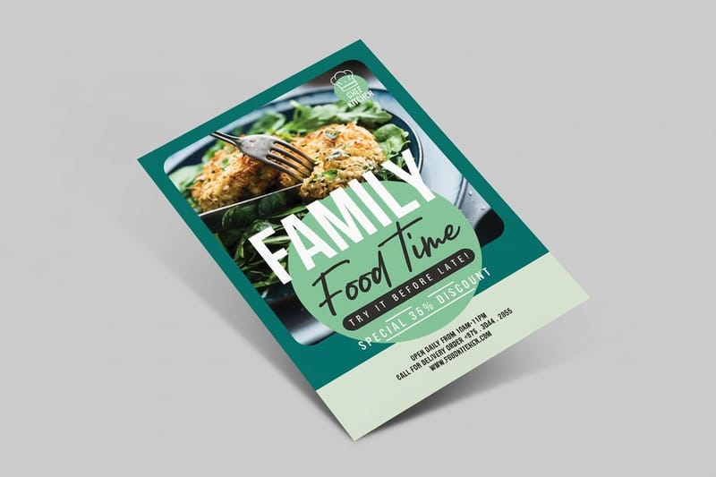
- The direct offer. The offer itself is the headline. "Free chimney inspection through March." Use it when the offer is strong and the category is crowded, such as a flyer drop where a dozen firms are pushing the same service.
Three habits kill headlines regardless of formula. Leading with your company name spends the biggest line on information that means nothing to a stranger. Writing a question the reader answers with "no" ends the conversation in one word. And setting the headline in all capitals costs you real reading speed, because capital letters strip the ascenders and descenders that let the eye recognize word shapes at a glance. Sentence case, set large, beats capitals set slightly larger.
Length: five to nine words is the working range for a headline read at a distance. If yours runs to fourteen, the fix is almost never a smaller typeface. It is a subhead. Split the idea, put the benefit in the big line, and let the qualifier sit underneath at half the size.
Body Copy and the Offer: Three Sentences and a Number
Body copy on a printed ad has exactly one job: keep the reader who was already interested moving toward the response. It is not there to persuade a sceptic, because a sceptic stopped reading at the headline.
Three sentences cover it. The first proves the headline is true. The second gives a detail only a real supplier would know, which is what separates you from the identical flyer in the same letterbox. The third removes the objection the reader is about to raise. Written for a flooring company, that is: "We have fitted 400 kitchens in Astoria since 2014. Engineered oak over a concrete slab needs a moisture barrier, and most quotes leave it out. We include it, and we clear the old floor the same day."
Notice what is missing. No "market leading". No "we pride ourselves". Neither of those sentences survives its subject being swapped for a competitor, which is the test for whether a line is doing any work.
Then the offer. An offer needs two things to function: a number and an end date. A discount is the weakest kind because it teaches people to wait for the next one, and it comes straight out of margin. A free measurement visit, a guaranteed installation window, or a bundled extra usually costs you less and reads as more concrete.
| Element | Before | After | Why the change works |
|---|---|---|---|
| Headline | Quality Flooring Solutions | Engineered oak fitted in a day, from $6 a square foot | Names what the reader gets, how long it takes, and what it costs. Three decisions answered in one line. |
| Body | We are a family run business committed to excellence and customer satisfaction. | 400 kitchens fitted in Astoria since 2014. We include the moisture barrier most quotes leave out. | Both sentences carry a fact a rival cannot copy without lying. The original survives any subject swap, so it says nothing. |
| Offer | Great prices, ask about our deals | Free measure and quote, booked within 48 hours, through March 31 | Gives a number, a speed and a deadline, so the reader has something to act on rather than something to feel. |
| Call to action | Contact us today for more information | Call 718 715 1926 and ask for the March measure slot | One channel, one verb, and a phrase that identifies which ad produced the call. |
The right hand column is the standard to hold every line to. If a sentence would still be true printed by the firm across the road, cut it and give the space to the headline.
Calls to Action That Name One Thing to Do
Most weak calls to action fail in the same way: they offer choices. Phone, website, QR code, email, and a shop address all crowded into a footer, each one slightly too small to use. Every extra route splits attention and none of them ends up prominent enough to act on.
Pick the one route you can service properly. If nobody answers the phone between nine and five, do not lead with the phone. If your booking page takes four taps to reach a form, a QR code sends people into friction they will abandon on the pavement. The best response channel is the one where the reader gets a human or a form within about ten seconds.
Write it as a verb plus a route plus a reason to move now. "Call 718 715 1926 before Friday for a same day quote" contains all three. "Contact us today" contains none, because it names no channel, no timeframe and no outcome.
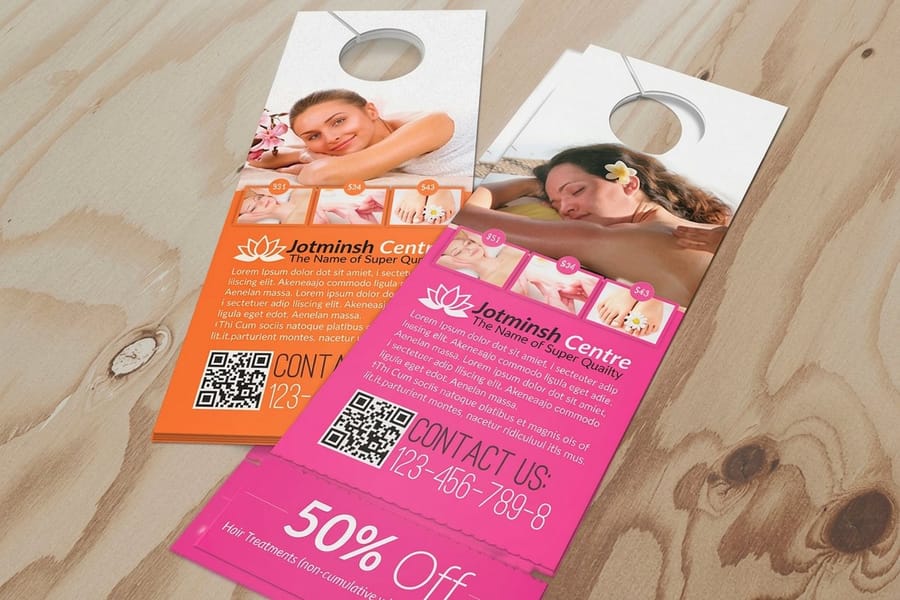
Two practical details that get skipped. First, give each printed piece a way of identifying itself in the response, such as a phone extension, a promo word, or a distinct QR destination. Without it you cannot tell whether the flyer or the postcard produced the calls, and next quarter you are guessing again. Second, size the call to action second only to the headline. On a door hanger, which starts at $290.41 for a run, the response line should be readable while the piece is still hanging on the handle, before anyone has picked it up.
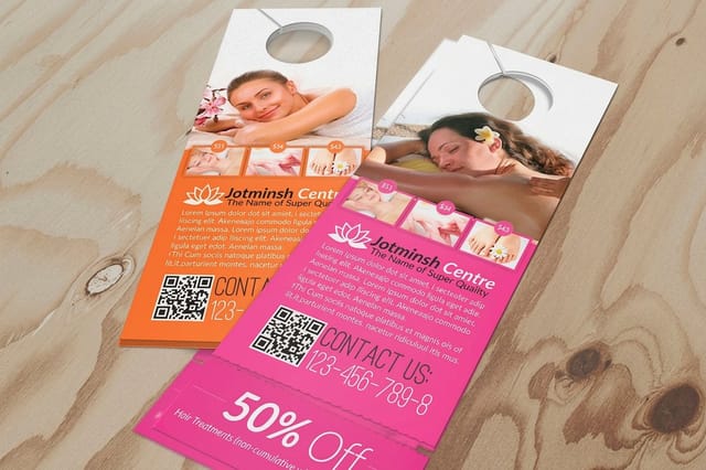
Door hangers and flyers work differently here. A flyer is often kept and acted on later, so a phone number and a website both make sense. A door hanger is read once, at the door, in about three seconds, so the QR code or the phone number needs to be big enough to use with one hand. Our notes on flyer distribution cover how the delivery method changes what the response line has to survive.
Typefaces and Hierarchy People Can Read at the Real Distance
Typeface choice is a copy decision, not a decoration decision, because it sets how many words fit before the ad becomes unreadable. Choose the type after you know the reading distance and before you finish the copy.
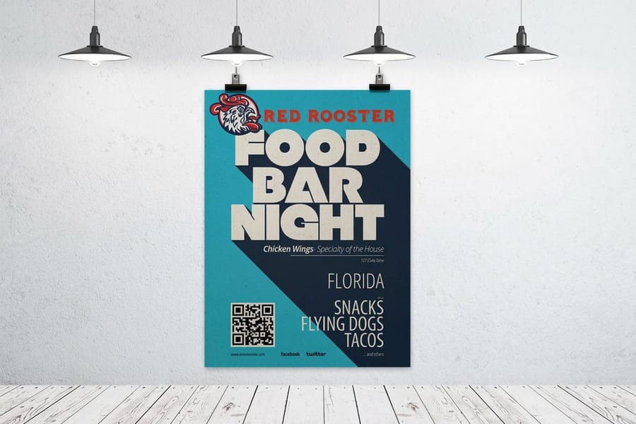
The old sign trade rule still holds: allow roughly one inch of capital height for every ten feet of viewing distance. That single line of arithmetic decides your word count.
| Format | Read from | Working headline size | Body copy floor |
|---|---|---|---|
| Postcard | About 14 inches | 24pt to 36pt | 9pt, 8pt only on uncoated stock |
| Flyer | Arm's length, in hand | 36pt to 60pt | 9pt to 11pt |
| Door hanger | 3 to 4 feet, at the door | Around 0.5 inch cap height | 10pt, and keep it to two lines |
| Window poster | 15 to 25 feet | 1.5 to 2.5 inch cap height | Usually none. The offer line is the body copy |
Work the poster row backwards and the point becomes obvious. At 2 inches of cap height on an 18 by 24 sheet, a headline of more than about six words will not fit on two lines. That is the constraint deciding the copy, so discovering it after the copy is approved means rewriting under deadline.
On typeface families: a sturdy sans with open counters and clearly different letterforms carries a headline at distance better than a display face with tight apertures. For body copy on a flyer, either a sans or a text serif works, so long as it has a real bold rather than a faux one applied by the software. Avoid condensed faces for anything the reader must scan quickly, because narrowing letterforms is exactly what makes a word shape harder to recognize at speed.
Set the hierarchy in three tiers and no more. Headline, then offer, then everything else. If four different sizes compete, the reader picks none of them. The specifics for each format sit in our guides on flyer fonts and postcard fonts, both of which name the faces that hold up in ink.
The Proof Pass, and the Mistakes It Catches
A typo on a website is a two minute fix. A typo on 5,000 flyers is 5,000 flyers. Print proofing is a different job to editing, and it is worth doing in a set order.
- Read the response details out loud, digit by digit. Phone number, extension, promo code, and web address. This is the single most expensive error class in print advertising and it is caught in fifteen seconds.
- Scan the QR code from the printed proof, not the screen. A code that works in the PDF can fail when it is printed small, reversed out of a dark color, or placed over a busy photograph.
- Check every date and every deadline against a calendar. "Through March 31" is wrong if your print and delivery schedule lands the piece on April 2.
- Read the headline backwards, word by word. Reading in reverse breaks the pattern that lets your brain autocorrect a familiar line, which is why the headline is where typos survive longest.
- Have someone outside the project read only the headline and the offer, then ask what the business does and what they would get. If they cannot answer both, the copy has failed, no matter how clean the proofread is.
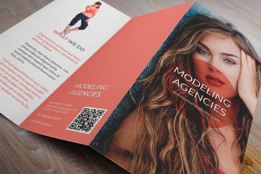
- Check the copy against the trim and the fold. On a folded brochure, a sentence that runs across a fold line gets creased through the middle. On any piece, live text needs to sit at least 0.125 inch inside the trim.
The mistakes that keep coming back are not spelling. They are structural: a headline that names the company instead of the benefit, an offer with no end date, a call to action with four routes, body copy that would be true of any competitor, and type set too small for the distance the piece will actually be read from. Every one of those is fixable in an afternoon and costs nothing extra to print.
One more that is specific to print: color on screen is not color on paper. A headline in a bright RGB orange comes back duller in CMYK, and if the contrast between headline and background was marginal on screen, it may be unreadable in ink. Check contrast on the printed proof, and if you are working across several pieces, our guide to colors that stay visible in advertising covers the pairings that survive distance and glare.
Getting the Finished Ad Print Ready
Copy that is approved still has to survive the production file. Three things trip up ad copy specifically, and all three are avoidable.
Bleed and safety. Build the file with 0.125 inch of bleed on every edge and keep all text at least 0.125 inch inside the trim line. Cutting has a tolerance, and a phone number sitting 2mm from the edge will lose a digit on part of the run. Starting from a correctly sized file removes the guesswork, and the blank template library has the trim and safety marked for every size we print.
Type outlines and resolution. Convert fonts to outlines before you send the file, or the press may substitute a face and reflow your carefully counted headline. Any logo or type placed as an image needs to be at 300dpi at final size, because a headline that looks acceptable on screen at 150dpi shows visibly soft edges in ink.
Format and quantity. Match the format to how the copy will be read. Standard flyers start at $39.54 and suit a headline plus a short body block. Standard postcards start at $16.48, which makes them the cheapest way to run two headlines against each other and count the difference. Standard posters start at $108.75 when the piece has to work across a room on six words. Standard brochures start at $57.11 and give you the panels for a longer argument, which only helps when the reader has already agreed to open it.
If you are still deciding which format the copy belongs on, our comparison of booklets, brochures and flyers lays out what each one can carry, and the flyer printing and postcard printing pages show the sizes, stocks and turnarounds available for each.
The checklist before it goes to press. Headline is five to nine words and names a benefit. The offer has a number and an end date. There is one call to action with one route. Body copy is three sentences and none of them survive a subject swap. Type sizes match the reading distance. Response details read out loud and checked. Text sits inside the safety margin. Dates match the delivery schedule. If all eight are true, print it.
Wally rewrites a flyer
One benefit, one number, one thing to do
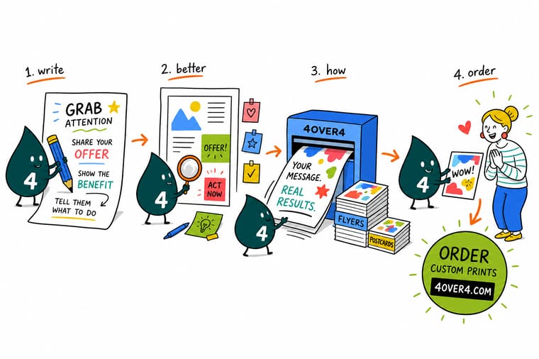
Wally reads the first draft and crosses out the company name in the big line, because nobody knows it yet. He puts the benefit there instead. He deletes the sentence about being family run and committed to excellence, since the shop across the road prints the same words. In goes a fact only this business can claim. Then he adds a price and an end date to the offer, picks one phone number, and makes it the second biggest thing on the sheet. Same paper, same ink, four times the calls.
Print your flyers →Specs and pricing
Formats your ad copy can land on, with starting prices
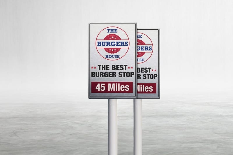
Compare the three formats most print ads run on, with live configuration choices and starting prices straight from the 4OVER4.COM configurator.



Print it
Put the finished copy on paper


Explore more
Where to go next


By the numbers
The printer your ad copy ends up on
Common Questions
Your print ad copy questions, answered
How many words should a print ad have?
Set the budget by format, not by preference. A poster read across a room works on a headline of five to nine words, an offer line, and a way to respond, which lands near 20 words total. A flyer handed to someone carries a headline plus 40 to 70 words of body copy. A brochure panel can hold 120 to 150 words because the reader has already committed to opening it. The number that matters is not the total, it is how many words sit above the fold of attention: the headline and the offer. If those two do not sell on their own, more words will not rescue them.
Should the headline mention my company name?
Usually not. The reader does not know your company yet, so the name spends the most valuable line on information that means nothing to them. Put the benefit in the headline and the name in the logo zone at the bottom. The exception is a business people already search by name, such as a well known local restaurant announcing a second location, where the name is the news.
What is a good call to action for a flyer?
A verb, one route, and a reason to act now. "Call 718 715 1926 before Friday for a same day quote" beats "Contact us today" because it names the action, the channel, the deadline and what the reader receives. Avoid stacking three response methods on a flyer. Choose the one you can answer fastest, because a call that rings out costs more than a missing QR code.
How do I test print ad copy without spending a fortune?
Print two versions of the same piece in a short run and split them by area or by day. Postcards make this cheap: standard postcards start at $16.48 at 4OVER4.COM, so a two version test costs less than a single day of paid search in most markets. Change one thing between the versions, usually the headline or the offer, and give each version a different phone extension, promo code or QR destination so the responses are countable.
What font size should body copy be on a flyer?
Nine to eleven point for a piece read in the hand, and never below 8 point on coated stock where the ink sits sharply and small counters can still fill. If your copy does not fit at 9pt, the answer is to cut words rather than drop to 7pt. Reversed type, white on a dark field, needs about a point more size and a heavier weight than the same text printed dark on white, because ink spread thins the white letterforms slightly.
Does the offer have to be a discount?
No, and discounts are often the weakest option because they train customers to wait. A free measurement visit, a same week installation slot, a bundled accessory, or a guaranteed turnaround are all offers, and each one costs less margin than 20 percent off. What every offer needs is a number and an end date. "Free site survey, booked within 48 hours, through March 31" is specific enough to act on.
Get Started
Copy approved? Get it on paper this week.
Pick the size, choose your stock, and upload the file. Flyers, postcards and posters print on the same schedule, so you can run two headlines against each other and count which one sells.
Legal Disclaimer
Gold Standard guarantees apply to all standard orders placed through 4over4.com. Price match requires verifiable proof of a competitor's published price for an equivalent product with matching specifications and turnaround time. Satisfaction guarantee covers manufacturing defects and print quality issues. Contact support with order number and documentation. On-time delivery rate based on tracked orders 1999 to 2026. Individual results may vary based on shipping carrier performance.
