
How to Design an Electrician Logo That Reads on a Van and on a Business Card


Symbols that read in one second, two colors that survive paper and vinyl, stroke weights that hold at half an inch, and the three items to print first.
A good electrician logo is one recognizable symbol, two colors, and a company name you can read from a moving van. Draw it in vector, keep the thinnest stroke at 1 pt or heavier at final size, and check it at half an inch before you commit. A bare lightning bolt is the most crowded mark in the trade, so pair it with a bulb, a plug, a panel or a house outline to make it yours.

Quick answer
One symbol, two colors, and a name that carries at distance
Design for the smallest and the fastest use first. The mark has to work at half an inch on a card corner and at 40 miles an hour on a van door, so it needs a solid silhouette, open type, and no detail that closes up when it shrinks. Build it in vector, keep the thinnest stroke at 1 pt or heavier at final size, and produce a one color version the same day you sign off the full color one. Then print the three items that put it in front of buyers: cards, a vehicle magnet, and yard signs.
What Separates a Working Electrician Logo From a Nice Drawing

A logo for an electrical contractor has a harder job than a logo for a shop. It has to be legible on a van at 40 miles an hour, legible on a yard sign from the sidewalk, and still legible in the corner of a 3.5 by 2 inch card in someone's wallet. Three surfaces, three distances, one file.
Three tests catch almost every problem before it costs money. The half inch test: print the mark at half an inch wide on a home printer and look at it at arm's length. If the symbol turns into a blob or the letters close up, the drawing is too detailed. The one color test: flatten it to solid black. If it falls apart without the color separating the shapes, the shapes are doing no work. The blur test: squint at it. The silhouette that survives is what a driver actually sees.
The other habit worth building early is to design the name and the symbol as a pair from the start, not to draw a beautiful mark and then hunt for a font. Most electrical companies are found by name and called by phone number, so the type carries more of the load than the icon does. The six principles of logo design apply here exactly as they do anywhere else, but the reading distance is what makes the trade different.
Choosing a Symbol That Reads Instantly

The symbol has about one second to say electrical. That rules out anything a homeowner has to interpret, and it rules in a short list that people already recognize.
| Symbol | What it signals | Watch out for |
|---|---|---|
| Lightning bolt | Electrical, fast, emergency response. | The single most used mark in the trade. On its own it is generic, and a thin zigzag loses its points at small sizes. |
| Light bulb | Residential service, lighting work, ideas. | Filament detail disappears below an inch. Draw the bulb as a solid silhouette, not as line art. |
| Plug or outlet | Small domestic jobs, outlets, fixtures, EV chargers. | Two round prongs read as a face at small sizes. Test it before you fall for it. |
| Breaker panel or meter | Service upgrades, commercial and industrial work. | Hardest to recognize at a glance. Best paired with the name doing the explaining. |
| House outline | We come to your home, residential first. | Very common in home services. Combine it with a bolt or bulb so it is not another roofer's logo. |
The way out of the generic bolt is a pairing rather than a replacement. Bolt inside a bulb, bolt as the crossbar of a letter in the name, bolt splitting a house outline, bolt formed by the gap between two shapes. Each of those still reads as electrical in a second, and none of them is what your three nearest competitors are using. Sketch six pairings on paper before you open any software, because the software will push you toward whatever effect is easiest.
One more constraint that saves a redraw later: keep the symbol inside a roughly square or circular boundary. Square marks drop cleanly into a social avatar, a hard hat decal and a truck door. A wide horizontal lockup does none of those without being rebuilt.
Picking Colors an Electrical Brand Can Actually Print
Two colors. One dark for the name, one bright for the symbol. Adding a third color mostly adds a way for the van, the cards and the shirts to disagree with each other.
Navy and charcoal carry most of the load because they hold contrast on a white card and on a white vehicle. Safety yellow and orange carry the trade signal and pop against dark fields. Electric blue reads as modern and technical, which suits panel upgrades and EV charger installs. Red works, but it also reads as fire and alarm, so it is worth thinking about if you also want that adjacent work.
The failure people run into is yellow on white. On a screen the backlight gives it enough separation. On paper and on a white van door it flattens into pale nothing at ten feet. If yellow is your brand color, set it on navy or black and let the dark field do the work. The same goes for thin white type reversed out of a light color.
Colors also move between substrates. A file that prints warm and saturated on a coated business card prints cooler and slightly duller on magnet vinyl, because the ink sits on a different surface. Lock a Pantone reference for the logo and quote it on every order rather than trusting the same CMYK build everywhere. Our guide on matching Pantone to CMYK explains where the shifts happen, and the OSHA safety color and ANSI code guide is worth a read before you claim yellow and orange as brand colors on a job site.
Fonts That Stay Readable on a Moving Van

Set the company name in a sans serif with open counters and a generous x-height. Bold or heavy weight, not light. The name has to hold up when it is reversed out of a dark panel, printed at 4 inches on a magnet, and reduced to 7 point on an invoice.
Skip the effects. Chrome bevels, drop shadows, outer glows and lightning bolt display fonts date fast and behave badly in print. A shadow that reads as depth on screen turns into a muddy gray halo on vinyl. If the wordmark needs an effect to look finished, the letterspacing is usually the real problem.
Two type sizes matter more than the rest. On a vehicle, the phone number is the piece a driver has to capture in about three seconds, so it gets weight and space. Twelve inch letters are readable at roughly 400 feet, four inch letters at roughly 130 feet, which is why a phone number set the same size as the address ends up unread. On print, keep the smallest logo type at 7 point or above and check the license number line, which is where legibility usually breaks first.
Convert type to outlines before you send anything to a printer. It removes the whole class of font substitution problems, and it is a two minute job. The walkthrough on converting text to shapes in Illustrator covers it, and the bleed, cut line and safety checklist covers what else the file needs before it goes on press.
Keeping It Simple Enough to Scale
Scalability is not a design opinion. It is a measurement. When a mark scales down, the strokes scale with it, so a line that looks confident at 3.5 inches becomes a hairline at half an inch and prints as nothing at all.
Work in vector from the first sketch, in Illustrator, Affinity Designer or Inkscape, and keep the whole mark on a small number of paths. Set the thinnest stroke so it stays at 1 pt or heavier at the smallest final size you plan to print. Keep gaps between shapes wide enough that ink spread does not close them. Avoid gradients in the primary mark, because they band on large format vinyl and they cannot be reproduced in embroidery or on a stamp at all.
Ship four files when the logo is signed off, and the job is genuinely done:
- Full color vector, AI or EPS or PDF, type outlined. This is the master.
- One color solid, for hard hat decals, stamps, embroidery, engraved plates and single color shirt screens.
- Reversed, white on a transparent background, for dark shirts, dark vehicle panels and night photos.
- Small size version, tagline removed and hairlines thickened, for anything under about an inch.
If the logo already exists and you are cleaning it up rather than starting over, the rebranding process guide lays out the order to change things so you are not reprinting the same items twice.
Putting the Logo on Cards, Magnets, Signs and Trucks

A logo earns nothing sitting in a folder. The first three items to print are the ones that reach three different buyers, and together they cost less than a service call.
Cards first. Every panel job ends with a homeowner asking for a card, and a 16 pt card feels noticeably more solid in the hand than a 14 pt one. Standard business cards start at $17.57, so there is no reason to hand out a printed slip. Full stock and finish options sit on the business card printing category page.
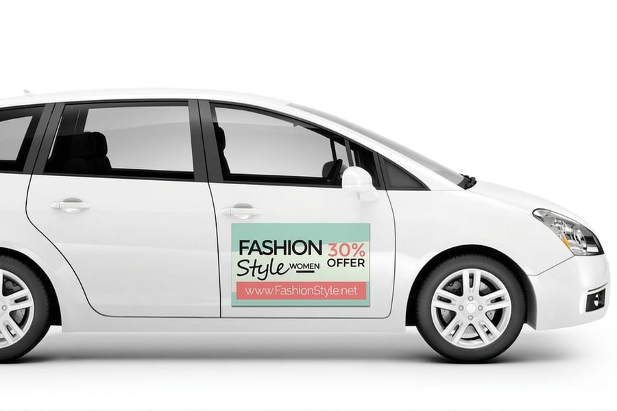
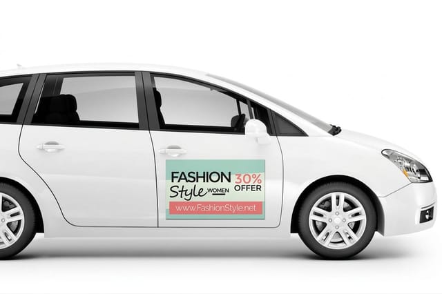
Then the vehicle. Car magnets start at $47.50 and give you branding you can peel off, which matters if the truck is also the family car or the vehicle is leased. Keep the name and phone number large, drop the tagline, and use the solid version of the mark. The vinyl truck lettering guide works through letter heights and reading distance in detail.
Then the job site. Yard signs start at $25.00 and work the street while you are inside the house, which is the cheapest local advertising in the trade. For a booth at a home show or a shop front, vinyl banners start at $79.00. And die-cut stickers, from $93.37, put the one color version on hard hats, tool cases, panel doors and the ladder that gets left in a driveway. Browse the full ranges under magnet printing and sticker printing.
Once those are running, a branded stationery set keeps invoices and quotes consistent with everything else. Start any layout from a correctly sized file in the blank template library so the mark lands inside the safety area on every product.
Wally checks the logo at every size
If it survives half an inch, it survives the van
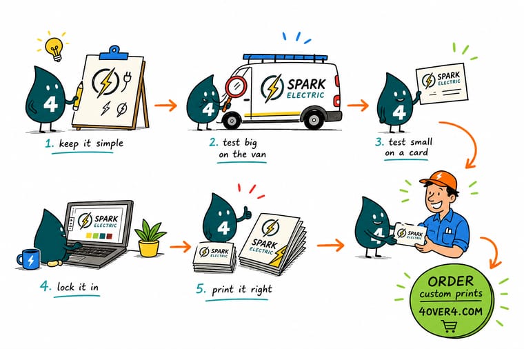
Wally draws the bolt inside the bulb in vector, then shrinks it to half an inch and looks again. The thick strokes hold. The hairline version turns into fog and the tagline closes up, so both come out. He flattens the mark to solid black for the hard hat decals, sets the phone number bigger than everything else for the van, and only then sends the file. Same logo, four sizes, one file that never has to be redrawn.
Print business cards with your logo →Specs and pricing
Sizes, options and starting prices for the first three items
Cards, vehicle magnets and yard signs, with live configuration choices and starting prices straight from the 4OVER4.COM configurator.



Print it
Put the new mark where customers see it


Explore more
Where to go next



By the numbers
Trade branding printed by 4OVER4
Common Questions
Your electrician logo questions, answered
What symbol should an electrician logo use?
Pick the one that matches the work you want more of. A lightning bolt reads as electrical to everyone, but it is also the most used mark in the trade, so it works best as part of a pairing rather than on its own. A bulb suits residential service and lighting retrofits. A plug or outlet reads as small domestic jobs. A breaker panel or meter reads as service upgrades and commercial work. A house outline with a bolt inside tells a homeowner in one glance that you come to the house, which is worth more than a clever abstract mark nobody can decode.
What colors work best for an electrician logo?
Two colors, one dark and one bright. Navy, charcoal or black carries the name and gives you contrast on white cards and on a white van. Safety yellow, orange or electric blue carries the symbol. The trap is yellow type on a white background, which looks fine on a backlit screen and nearly vanishes on paper and on a white vehicle. If you want yellow, put it on the dark field, not the light one. Our guide to OSHA safety colors and ANSI color codes covers what those colors already signal on a job site.
How small can an electrician logo go before it stops working?
Test it at half an inch wide, which is roughly a favicon, an invoice header and the corner of a hard hat decal. At that size a stroke you drew at 0.25 pt on a 3.5 inch card measures under a tenth of a point and prints as nothing. Keep the thinnest line in the mark at 1 pt or heavier at final size, keep counters in the type open, and drop the tagline from any version under about an inch wide.
What file format does the printer need for my logo?
A vector file, either AI, EPS or PDF, with all type converted to outlines so a missing font cannot substitute itself. Vector art scales from a business card to a vinyl banner with no loss. A 500 pixel PNG pulled off a website will look soft on a card and genuinely bad on a 24 inch magnet. If your designer only sent a PNG, ask for the source file before you order anything larger than a card. Our walkthrough on converting text to shapes in Illustrator shows the outlining step.
Do I need a different version of the logo for a van magnet?
You need the same logo with different rules applied. On a moving vehicle the readable elements are the name and the phone number, so those get the largest type on the panel and the symbol supports them. Drop any tagline, thicken hairlines, and use the solid one color or two color version rather than a gradient, because gradients band on large format vinyl. Twelve inch letters read at roughly 400 feet, four inch letters at roughly 130 feet, so size the phone number for the distance a driver actually sees you from.
What should I print first once the logo is done?
Cards, a vehicle magnet and yard signs, in that order, because each one puts the mark in front of a different buyer. Standard business cards start at $17.57, car magnets at $47.50 for the pair, and yard signs at $25.00. That is the whole starter kit for under two hundred dollars, and it is the point where a logo stops being a file and starts booking calls.
Get Started
Logo finished? Get it on paper and on the truck.
Upload the vector file, pick your stock and size, and we print cards, magnets and signs that carry the same mark at every distance.
Legal Disclaimer
Gold Standard guarantees apply to all standard orders placed through 4over4.com. Price match requires verifiable proof of a competitor's published price for an equivalent product with matching specifications and turnaround time. Satisfaction guarantee covers manufacturing defects and print quality issues. Contact support with order number and documentation. On-time delivery rate based on tracked orders 1999 to 2026. Individual results may vary based on shipping carrier performance.
