
How to Build a Consistent Visual Identity That Holds Up Everywhere


Five decisions, one page of rules, and a rollout order that matches how often people see you. Plus the one place consistency reliably breaks: color moving from screen to paper.
A consistent visual identity is five decisions you make once and then refuse to change: one logo file set, two or three colors with real values, two typefaces, a clear space rule, and one imagery treatment. Write them on a single page with actual numbers, give everyone the correct files, and apply them in order of visibility. Consistency comes from distribution and discipline, not from a better looking logo.

Quick answer
Five locked decisions, written down with real values
Identity is repetition, and repetition needs rules other people can follow. Lock the logo file set, the palette, the typefaces, the clear space and the imagery treatment. Record each one with a number rather than an adjective, including a separate color value for coated stock, uncoated stock and screens. Then roll it out starting with whatever people see most often, which for almost every business is a business card and an email signature.
Lock the Five Decisions Everything Else Depends On
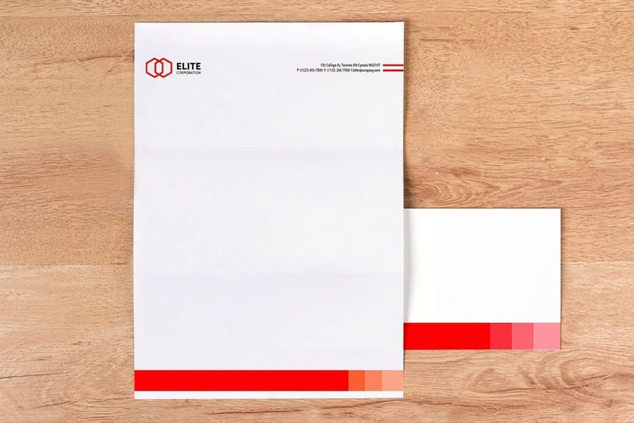
An identity is not a mood board. It is five decisions that get made once, written down with real values, and then applied whether or not anyone feels like it that week.
| Decision | What you actually lock | Where it breaks first |
|---|---|---|
| Logo | A horizontal lockup, a stacked version, an icon on its own, each as vector plus a transparent PNG. | Someone screenshots the logo off the website and uses a 400 pixel JPG on a banner. |
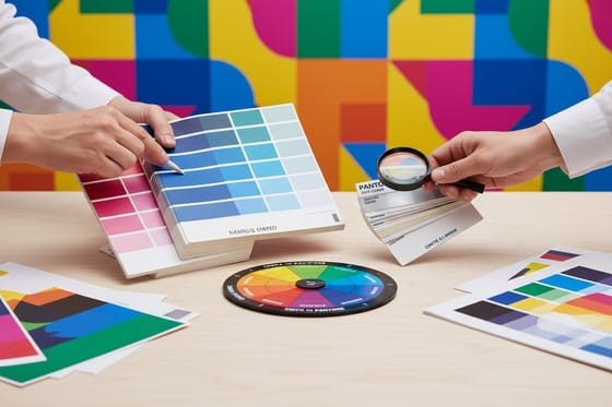
| Color | Two or three colors, each with a Pantone, a coated CMYK build, an uncoated CMYK build, and a hex. | A hex code gets handed to a printer, converted automatically, and comes back a different color. |
| Type | One typeface for headings, one for body, with the specific weights and a fallback that is on every machine. | The licensed font is missing on a colleague's laptop, so the deck quietly falls back to Calibri. |
| Spacing | Minimum clear space around the logo, expressed as a fraction of the logo height, plus a minimum print size. | The logo gets crammed against a trim edge or shrunk until the tagline is unreadable. |
| Imagery | One treatment: all photography, or all illustration, with a rule about crop and color cast. | Stock photos in five different styles land in the same brochure and the page stops looking like one company. |
Read the third column, because that is the whole job. Nothing on this list fails because the design was weak. It fails because a file was missing, a value was never written down, or nobody said what the rule was. Fix the supply of correct files and most consistency problems disappear on their own.
If the logo itself is still unsettled, sort that out first. Our guide to the key principles of logo design covers what survives being shrunk to a favicon, and the full logo design guide walks the process from sketch to final files.
Write One Page Other People Can Follow

Consistency is a distribution problem. Every person who touches your brand, including the printer, works from whatever file they can find, so the fix is to make the correct file the easiest one to find.
One page is enough, and it holds these things:
- Where the logo files live, named plainly, in vector and PNG, with the correct version for light and dark backgrounds.
- Every color value, laid out per surface. One row per color, one column per output: Pantone, coated CMYK, uncoated CMYK, hex.
- The two typefaces, the weights you use, and the substitute to use when the licensed font is unavailable.
- Clear space and minimum size, as a measurement rather than a description. "Keep it clean" is not a rule anyone can check.
- Three do-not rules, the ones you have actually seen broken. Do not stretch it, do not recolor it, do not put it on a busy photo.
Keep it to a page on purpose. A forty page guideline deck signals seriousness and then sits unopened in a shared drive, while a one page sheet gets attached to the brief and read. Send it with every print job along with your artwork, and pair it with a correctly sized layout from the blank template library so the file arrives at the right trim and bleed. If you would rather build the piece in a browser, our online design templates hold the type and spacing for you.
Where Identity Falls Apart, and It Is Almost Always Color
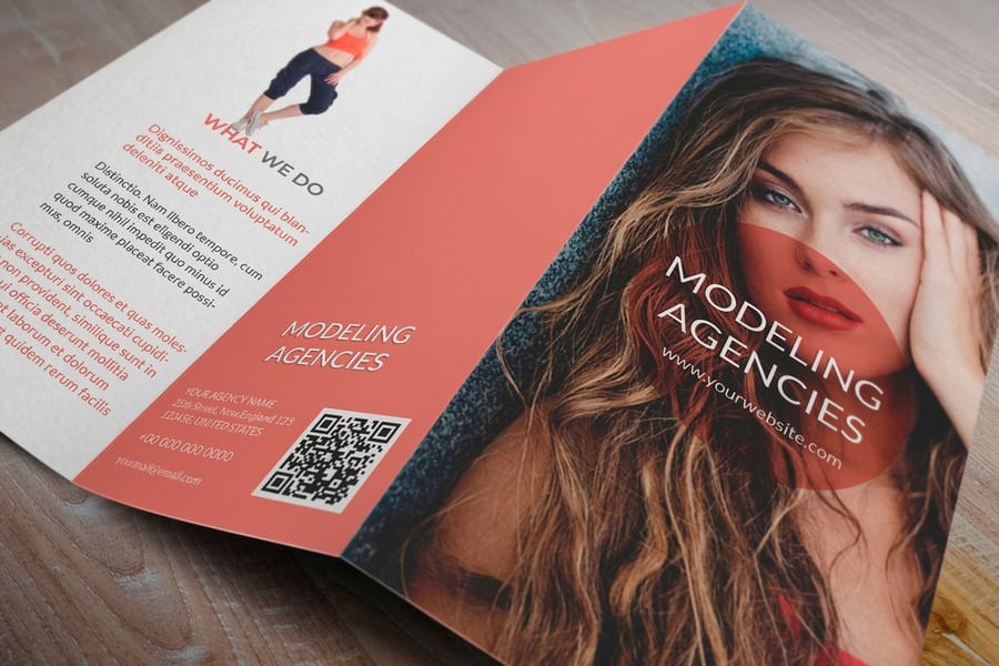
The file is identical. The result is not. A screen emits light and can show colors that no ink can produce, so a saturated brand green or orange chosen on a monitor will print duller no matter who prints it. That gap is physics, not a printing fault, and the sooner it is designed around the less it costs.
Paper adds the second shift. Coated stock holds ink on the surface, so color sits bright and sharp. Uncoated stock absorbs it into the fiber, so the same CMYK build reads lighter and softer, and fine type gains a fraction of weight as the ink spreads. A brand color that was approved on a coated business card can look washed out on an uncoated letterhead using the exact same numbers. The fix is not to argue with the press. It is to specify a slightly heavier build for uncoated and record both values.
Then there are the surfaces that do not mix color at all. Cut vinyl and embroidery thread come in stock colors that you choose from a book, so your brand color gets matched to the nearest available rather than mixed to order. Expect a near miss and pick the one you can live with in advance, instead of discovering it on a delivered sign.
Two habits keep this under control. Anchor the palette to a Pantone reference and convert deliberately, which our Pantone to CMYK matching guide explains step by step. Then sign off on paper: order the first run small, hold it under daylight, and only write the value into the brand sheet once you have seen it printed. Background on how ink behaves on different stocks is in our guide to color and ink in commercial printing.
Roll It Out in the Order People Actually See You

Nobody has the budget to replace everything at once, and trying to is how a rollout stalls halfway. Order the work by how often each item is seen, and let the rest turn over naturally as stock runs out.
First, the things handed over in person and sent every day. Business cards and your email signature. Standard business cards start at $17.57, which makes this the cheapest place your identity becomes real. Get the color signed off here, because whatever you approve on the card becomes the reference for everything after it.
Second, correspondence. Standard letterheads start at $99.95 and printed envelopes at $142.99. These carry higher minimum quantities than cards, so wait until the palette is settled. An envelope with the old logo arriving after the new cards went out is the classic self inflicted wound, and it is avoided simply by ordering these two together.
Third, the pieces that explain you. Standard brochures start at $57.11 and are where the type and imagery rules finally get exercised across multiple panels. If a brochure looks like one document rather than five pages stapled together, the identity is working.
Fourth, the cheap carriers. Die-cut stickers start at $93.37 and put the mark on packaging, laptops and boxes at almost no unit cost. Browse the range in sticker printing or label printing if the mark is going on product packaging.
One caution on timing. Do not scrap usable stock to force a same day switchover unless a genuine rebrand demands it. Run existing cards down, replace at the natural reorder point, and put the saved money into getting the first printed piece exactly right. If a full rebrand is what you are planning, the sequencing and the reprint cost are covered in our rebranding process guide, and the matched set approach is in the custom stationery guide.
Wally explains visual identity
Same five decisions, every single piece
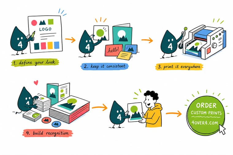
Wally pins one page to the wall: the logo files, three colors with their print and screen values, two typefaces, the clear space around the mark, and one photo style. Then he prints a card, a letterhead, an envelope and a sticker from that same page. They match because the rules were written with numbers, not adjectives. The one thing he checks by hand is color, because ink on uncoated paper never looks quite like a screen.
Print your business cards →Specs and pricing
The core identity pieces, sizes and starting prices
Cards, letterhead and brochures carry most of an identity in its first year. Configure each one below with live options and starting prices from the 4OVER4.COM configurator.


Print it
Put the identity on paper



Explore more
Where to go next





By the numbers
Brand printing you can repeat at 4OVER4
Common Questions
Your visual identity questions, answered
How many colors should a brand actually use?
One primary, one secondary, and one accent is enough for most businesses, plus a neutral for text. The limit is practical rather than aesthetic: every extra color is another value you have to specify for coated stock, uncoated stock, screens, vinyl and fabric, and another thing that can drift. A three color palette also prints on almost anything without special handling. If you inherit a palette of eight colors, pick the three that appear most often and demote the rest to illustration use only.
Do I need a full brand guidelines document?
Not at the start. A single page covers the same ground for a small business: logo file names and where they live, the color values for print and screen, the two typefaces with their weights, the minimum clear space around the logo, and a short do-not list. Long guideline decks tend to be written once and never opened. The one page version gets attached to emails and actually gets followed, which is the only thing that produces consistency.
Why does my logo look different on my letterhead than on screen?
Screens emit light and paper reflects it, so a screen can show colors no ink can reach, especially bright greens, oranges and deep blues. On top of that, uncoated stock absorbs ink into the fiber and reads lighter and softer than the same build on coated stock. That is why the master spec carries a separate CMYK value for coated and uncoated, and why the honest way to sign off a brand color is to hold a printed sample under daylight rather than compare it to a monitor.
Can I use a different logo version for social media?
Yes, and you should prepare one deliberately instead of letting someone crop the main lockup. A profile avatar is a small square, so a horizontal lockup with a tagline turns to mush at that size. Build a stacked or icon-only version, set a minimum size for the full lockup, and note in the brand sheet which version belongs where. That is a variation inside the rules. Someone squashing the main logo to fit a circle is not.
How often should a visual identity change?
Rarely, and never quietly. Recognition is built by repetition, so a palette or logo that shifts every year never accumulates any. Refresh the type and layout system when it stops working for the formats you actually use, and change the logo itself only when the business genuinely changed. If a real rebrand is coming, plan the print run around it, because reprinting cards, letterhead and packaging is the cost most rebrands underestimate.
What is the cheapest way to look consistent on a small budget?
Spend the money on the piece that gets handed to people and standardize everything else with free discipline. Standard business cards start at $17.57 at 4OVER4.COM, and getting one printed piece right buys more credibility than five inconsistent ones. Use the same two typefaces in every document, put the same logo file in every template, keep your email signature matching the card, and print the rest as you need it rather than ordering a full stationery set on day one.
Get Started
Test the identity on 100 business cards from $17.57
Start with the piece people hold. Pick your stock, upload the approved logo files, and check the printed color before you commit it to the brand sheet.
Legal Disclaimer
Gold Standard guarantees apply to all standard orders placed through 4over4.com. Price match requires verifiable proof of a competitor's published price for an equivalent product with matching specifications and turnaround time. Satisfaction guarantee covers manufacturing defects and print quality issues. Contact support with order number and documentation. On-time delivery rate based on tracked orders 1999 to 2026. Individual results may vary based on shipping carrier performance.
