
Pantone Colors History and Meaning


Who is Pantone, in short
Pantone is a New Jersey company that publishes the Pantone Matching System, the numbered color standard printers and designers use to reproduce one exact color anywhere. Lawrence Herbert built the system in 1962 and bought the company that made it. Since 2007 Pantone has been part of X-Rite, a Danaher company. It earns its money from the printed color guides and swatch books, from software and licensing of the color libraries, and from consulting through the Pantone Color Institute, which also names a Color of the Year every December.
Pantone colors history and meaning, from print shop to color authority
Pantone colors history and meaning trace back to a small New Jersey printing company in the 1950s that grew into the world's most recognized color standard. Today the Pantone system includes more than 2,100 spot colors used by designers, printers, and brands in every industry. 4OVER4.COM leans on Pantone standards daily to deliver accurate, consistent color on every job, from business cards to large-format signage.
Ever wonder where Coca-Cola found that dramatic red, or why the Barbie logo looks exactly the same on every product, billboard, and screen? If color consistency matters to you, thank Pantone, the company that turned color into a universal language. Since 1962, Pantone has shaped how we talk about, match, and reproduce color across print, fashion, interiors, and digital media.
Whether you are choosing colors for standard business cards or building a full brand identity from scratch, understanding Pantone's origins gives you an edge. Here is how a small ink company rewrote the rules of color.
How Pantone was born in the 1950s

Pantone was created by Lawrence Herbert. He joined the New Jersey printing company M and J Levine Advertising in 1956, bought it outright by 1962, renamed it Pantone, and that same year introduced the Pantone Matching System, the numbered guide that gave every color a reproducible ink formula. Everything below is how a chemistry graduate with a part-time job turned a messy back room process into the language printers and designers still speak.
Pantone started life as M and J Levine Advertising, a commercial printing company in Carlstadt, New Jersey. They made color charts for cosmetics companies, paint manufacturers, and the fashion industry. It was straightforward work, but mixing and matching inks was messy, inconsistent, and frustrating for everyone involved.
In 1956 a young chemistry graduate named Lawrence Herbert joined the company part-time. Herbert had a sharp eye for pigment formulation, and he quickly spotted the problem that plagued the whole industry. There was no standard way to communicate color. A designer in New York could ask for sky blue and a printer in Chicago would produce something completely different. Every shop mixed its own inks, and every batch drifted from the last.
Herbert used his chemistry background to systematize pigment production. He simplified the stock of colored inks and created reproducible formulas. By 1962 he had bought the company outright, and that same year he introduced the Pantone Matching System, a numbered color guide that gave every shade a specific, reproducible formula.
This was the turning point. For the first time a designer could say Pantone 185 C and a printer anywhere in the world would know exactly which red to mix. No guessing, no close enough. If you have ever used CMYK or PMS color guides to prepare a print file, you are using Herbert's invention.
Print it
Business cards that hold your exact color
Standard business cards are the fastest way to prove a Pantone match, printed sharp on your choice of stock.
The Pantone Matching System, why it changed everything
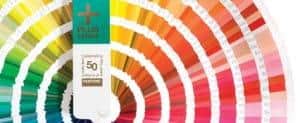
Before PMS, color communication in printing was a guessing game. A client pointed at a swatch and said I want this. The printer eyeballed it, mixed some ink, ran a test sheet, and hoped. Move the job to another printer and the color could shift hard. Brand consistency across vendors was almost impossible.
The Pantone Matching System solved this by giving every color a unique alphanumeric code tied to a precise ink formula. The system started with around 500 colors and has grown to more than 2,100 spot colors in the current Pantone Formula Guide. Each color is printed on both coated (C) and uncoated (U) paper, because the same ink looks different depending on the surface.
That distinction matters more than most people realize. A Pantone color on glossy coated stock looks vivid and saturated. The same formula on uncoated stock reads softer and more muted, because the ink absorbs into the paper fibers. When you order printed materials from 4OVER4.COM, knowing this difference helps you pick the right paper and finish for your project.
Quantity and price
Business card pricing and specs
Real configurator numbers, so you can see how quantity, stock, and finish shape the cost of a color-critical run.
| Quantity | Price Per Unit | Total |
|---|---|---|
| 100 | 17.6¢ | $17.57 |
| 200 | 11.5¢ | $23.07 |
| 300 | 9.15¢ | $27.46 |
| 400 | 7.96¢ | $31.86 |
| 500 | 7.25¢ | $36.26 |
| 600 | 6.77¢ | $40.64 |

PMS versus CMYK, when to use which
Here is a common point of confusion. PMS colors are pre-mixed spot inks, each applied in a single pass. CMYK stands for cyan, magenta, yellow, and black, a four-color process where tiny dots of these inks overlap to simulate a wide range of colors.
PMS gives you exact color accuracy. CMYK gives you a broader range at a lower cost for full-color images. Most commercial print jobs use CMYK, but brands that need precise matching, think Tiffany blue or UPS brown, specify PMS colors to guarantee consistency.
The 4OVER4.COM online designer lets you work with both systems. For projects where brand color is non-negotiable, putting a Pantone number in your file tells the printer exactly what you need. For photo-heavy pieces like postcards or brochures, CMYK handles the job beautifully.
Compare options
Popular business cards, side by side
Stock, finish, quantity, turnaround, and from-price across our most-ordered business cards.
 free business cards |  Standard Business Cards |  3D Lenticular Business Cards |  Metallic Foil Business Cards | |
|---|---|---|---|---|
| Min price | Free | $17.57 | $690.88 | $222.13 |
| Paper / stock | 14pt Gloss Cover | 14pt Gloss Cover | 31pt Lenticular Lens | 16 Point Silk Laminated |
| Finish | - | Standard Finish | - | - |
| Size | 2" x 3.5" | 2" x 3.5" | 2" x 3.5" - Vertical | 2" x 3.5" |
| Default qty | 200 | 100 | 500 | 500 |
| Turnaround | 5 business days | 3 business days | 22 business days | 7 business days |
| Rating | ||||
| View & customize | View & customize | View & customize | View & customize |
Color as a mirror, how world events shape Pantone trends
Pantone colors do not exist in a vacuum. They reflect what is happening in culture, politics, technology, and the collective mood of the moment. The Pantone Color Institute, the consulting arm of the company, tracks these shifts and translates them into forecasts that guide fashion, product design, home decor, and print.
Remember the neon explosion of the 1980s? Those electric pinks and acid greens were not random. They came from an era of economic expansion, MTV culture, and a more is more attitude. The music was loud and the colors matched. Then the 1990s arrived with grunge, minimalism, and a quieter palette of muted earth tones and washed-out blues.
The early 2000s brought globalization and the tech boom. Pantone answered with shades like Cerulean, the calming sky blue named Color of the Year in 2000, plus Chili Pepper and True Red, colors that balanced optimism with the uncertainty of a post-9/11 world.
The Color of the Year tradition
Since 2000, Pantone has crowned a Color of the Year each December. A group of color experts from around the world gathers at a private location in Europe, reviews trend data from runways, art, travel, technology, social media, and even politics, and then votes. The chosen color becomes a cultural talking point that shapes everything from wedding palettes to packaging to the colors you see in funny print ad examples and campaigns worldwide.
- Emerald (2013) stood for growth, renewal, and prosperity during a global recovery.
- Radiant Orchid (2014) was a warm, inviting purple that encouraged creativity.
- Living Coral (2019) drew attention to environmental concerns and ocean conservation.
- Classic Blue (2020) offered calm and stability just before a year of upheaval.
- Viva Magenta (2023) was a bold red rooted in nature, signaling courage.
- Peach Fuzz (2024) was a soft, nurturing tone reflecting compassion and togetherness.
- Mocha Mousse (2025) is a warm brown evoking comfort, simplicity, and sensory pleasure.
Pantone beyond print, fashion, flags, and identity
What started as a printing tool has spread into nearly every field where color matters. Fashion designers use Pantone seasonal reports to plan collections months ahead. Interior designers reference Pantone guides for paint, fabric, and finishes. Product teams at companies like Apple and Samsung use Pantone codes to communicate exact colors to factories in different countries.
Flags, laws, and Pantone numbers
Here is a fact that surprises most people. Many governments use Pantone codes to define their official flag colors. In 2003 the Scottish Parliament debated recognizing the blue in its national flag as Pantone 300. Texas has legislation specifying the PMS colors of its state flag. Canada, the European Union, and dozens of other nations reference Pantone numbers in their brand guidelines. A flag printed in Tokyo should look identical to one printed in London, and PMS codes remove that ambiguity.
Even 3D lenticular posters and specialty products benefit from Pantone standardization. When you produce eye-catching promotional pieces for the posters and wall art lineup, color accuracy across different printing methods and substrates is what separates professional work from amateur attempts.
The Pantone Hotel and cultural reach
Pantone's influence reaches into hospitality and lifestyle. The Pantone Hotel in Brussels is themed entirely around the color system, with a different palette on each floor and room keys shaped like color swatches. Pantone has also collaborated with major brands on limited-edition mugs, phone cases, and furniture, each identified by its Pantone number. Color is not only a technical specification, it is emotional, and Pantone sits at the bridge between the two.
Wall art specs
Acrylic prints for color that pops
Vivid, gallery-grade color on acrylic, a favorite for brand displays across posters and wall art.
How Pantone stays relevant in a digital world
Pantone did not become a global standard by standing still. As technology evolved, so did its products. The original formula guide swatch books are still in production and still essential, but Pantone has expanded well beyond paper.
In 2007 Pantone introduced the GOE system, a collection of more than 2,000 new colors with a redesigned numbering format and adhesive-backed GoeSticks that designers could peel and place straight onto a mood board.
Pantone Connect, its digital platform, lets designers reach the full library inside Adobe Creative Cloud. You can search, save, and share colors, convert between systems, and build palettes that sync across a team. For designers working with the 4OVER4.COM online designer, accurate Pantone references in your files mean fewer surprises when your print arrives.
Pantone also partnered with X-Rite, a leader in color measurement, to produce spectrophotometers and color management hardware that verify colors against Pantone specs. That partnership closed the loop between digital design and physical production. For more on color, branding, and print technique, browse the full library of printing articles, and the 4OVER4.COM Help Center walks you through file setup step by step.
The psychology and meaning behind Pantone colors
Understanding Pantone colors history and meaning is not only about numbers and formulas. It is about what colors communicate to the people who see them. Color psychology plays a direct role in branding, marketing, and behavior.
Red signals energy, urgency, and passion, which is why Coca-Cola and Target use it to grab attention. Blue conveys trust, stability, and professionalism, the reason banks, tech companies, and healthcare brands lean on it. Green reads as growth, health, and sustainability, the default for eco-friendly and wellness brands. Yellow brings optimism and warmth and is one of the most visible colors in the spectrum. Black carries sophistication and luxury, which is why high-end brands print it on thick, textured stock.
When you design logo sticker design ideas or any branded material, choosing your Pantone colors with intent, not just aesthetics, gives your brand a psychological advantage. If you want a deeper look at color and print, see what the color of your business cards means for the way people read your brand.
Using Pantone colors in your print projects
Knowing the history is great. Applying it is better. If you have a brand guide, and you should, it likely includes Pantone codes. When you order business cards, postcards, banners, or any printed piece, putting those numbers in your design file keeps color consistent across everything. Your business card should match your letterhead, which should match your trade show banner.
4OVER4.COM prints on more than 60 paper types with multiple finishes. Different papers absorb ink differently, so specifying Pantone colors rather than only RGB or hex values gives the press operator a precise target to hit on any substrate. Designers building a book can study graphic design portfolio examples to see how consistent, intentional color creates cohesion across a body of work.
Not every job needs a spot color. For full-color photos and complex graphics, CMYK is the cost-effective choice. But for logos, brand elements, and colors that absolutely must match, a Pantone spot color is worth the investment. It is the difference between close enough and exact.
Start fast
Templates and print-ready blanks
Design templates and exact-size blanks so your Pantone-specified artwork lands inside the cut line.






What comes next for Pantone
Pantone is not slowing down. The company keeps expanding its digital tools, adding colors to its libraries, and pushing into augmented reality and virtual design. As screen-based work and physical print continue to coexist, a universal color standard only grows more useful.
The rise of sustainable printing and eco-friendly inks brings fresh challenges for color matching. Pantone works with ink makers and paper mills so responsible materials can still hit accurate color. Understanding Pantone colors history and meaning gives you a framework for smarter, more intentional color in every project you touch. Color is not decoration, it is communication, and Pantone gave us the vocabulary to do it right.
Wally decodes the Pantone number
One code, the same color on every printed piece
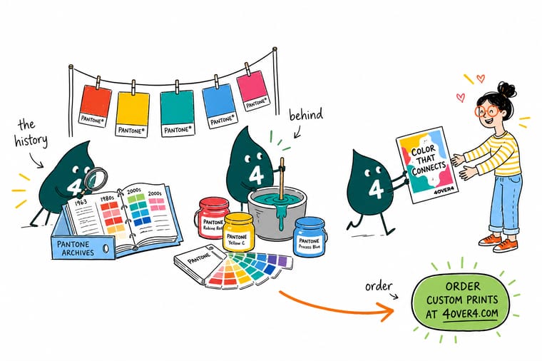
A Pantone number is a promise that your color prints the same everywhere. Pick your shade from the Formula Guide, drop the code into your file, choose coated or uncoated to match your stock, and 4OVER4.COM hits the target across 60+ papers. Spot color for logos, CMYK for photos, and your brand looks consistent every time.
Order business cards →What to remember about Pantone's color legacy
Explore more
Keep exploring color, print, and design
Related products, categories, and articles across 4OVER4.COM, one card each, so you can go deeper on color and print.
Ready to put Pantone precision in your print?
Specify your Pantone number, upload your art or start from a template, and 4OVER4.COM matches your brand color across every piece.
Common questions about Pantone color history
What is Pantone known for?
The Pantone Matching System: a library of more than 2,100 numbered spot colors, each with an ink formula, printed on coated and uncoated stock so a color looks the same from one printer to the next. The Color of the Year announcement every December is its most public moment.
How does Pantone make money?
From the physical color guides and swatch books designers buy, from licensing its color libraries to software and to product makers, and from consulting through the Pantone Color Institute. Since 2022 access to the full libraries inside design software is a paid subscription.
Who is Pantone owned by?
X-Rite acquired Pantone in 2007, and X-Rite is owned by Danaher, the US industrial group. Pantone still operates under its own name from Carlstadt, New Jersey.
What is the Pantone controversy?
In 2022 the licensing deal between Pantone and Adobe ended, the Pantone libraries were removed from Photoshop, Illustrator and InDesign, and Pantone colors in existing files turned black unless the user paid for the Pantone Connect subscription. Designers objected to paying for colors they had used for years.
What are the best practices for using Pantone colors in print design?
Reference the physical Pantone Formula Guide rather than your screen, since screens show RGB light that ink on paper cannot fully match. Specify Pantone codes in your design files, choose between coated (C) and uncoated (U) based on your stock, and request a hard-copy proof before a full run. For file setup help, visit the 4OVER4.COM Help Center.
How do I choose the right Pantone colors for my brand?
Start with the emotion you want to communicate. Pantone colors history and meaning shows that red drives urgency, blue builds trust, and warm neutrals signal comfort. Pick two or three Pantone colors that fit your brand, then test them on both coated and uncoated paper. A product like dry erase aluminum panels renders a Pantone code differently than a business card, so always test on your real material.
What makes Pantone colors effective for marketing materials?
Consistent color builds recognition. When your postcards, banners, stickers, and signage all use the same Pantone-specified colors, customers recognize your brand instantly. Pantone standards mean a color printed on dry erase coroplast signs matches the same color on your business cards, which builds trust across every touchpoint.
How much should I budget for Pantone spot color printing?
Spot color usually costs more than standard CMYK because each Pantone ink needs its own mix and press plate. For most small-to-medium runs, expect a modest premium over four-color process. The investment pays off when brand color accuracy is non-negotiable, like logos, packaging, and high-visibility signage. For everyday full-color work, CMYK delivers excellent results at a lower price.
