
Latino Designers Shaping Print Design Influence in 2026


How Latino designers shaped modern print design, and why it matters now
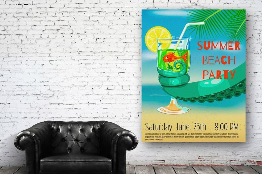
The work of Hispanic and Latino graphic designers runs deep through American visual culture, from bold street murals to the posters, business cards, and banners you see every day. Latino designers print design influence shows up in the color, the typography, and the confidence of the layouts. Hispanic Americans represent roughly 19% of the U.S. population, which makes this community one of the most impactful forces in American art and design. National Hispanic Heritage Month gives us a reason to spotlight talented Latino graphic designers whose work has reshaped print, and 4OVER4.COM celebrates that creative legacy because great print starts with great design.
Whether you are building a brand identity or looking for business card design inspiration, the visual language pioneered by these artists can spark ideas you will not find anywhere else. Their influence touches everything from color theory to typography to the way we think about public space. Here are the Hispanic and Latino graphic designers whose print contributions deserve your attention, starting with seven names that changed what a printed page looks like.
The canvas for the work
Bold posters, printed sharp
Turn a color-forward, culturally rich design into a full-color poster on the stock and finish of your choice.
Carlos Cruz-Diez and color as a living, breathing element of Latino print design
The work of Venezuelan artist Carlos Cruz-Diez has been exhibited around the world. In the U.S. you can find his pieces at the Miami Art Museum, the Museum of Fine Arts in Houston, and the Americas Society in New York. Even if you never set foot in a gallery, his influence reaches you. His kinetic color installations decorated the walkways of Marlins Stadium and the crosswalks of Miami's Wynwood district, turning public infrastructure into print-inspired visual experiences.
Cruz-Diez treated color as an autonomous reality, something that shifts and changes depending on the viewer's position and the surrounding light. That philosophy directly influenced modern print design, where designers use color gradients, optical effects, and layered inks to create pieces that feel alive on paper.
Search online and you will find posters, packaging, and logo sticker design ideas that borrow from his kinetic color vocabulary. If you are designing anything that needs to grab attention on a shelf or in someone's hand, study his work. The lesson is clear. Color is not just a choice, it is a strategy, and that discipline is one of the clearest debts print design owes to Hispanic and Latino graphic designers.
Quantity and price
Poster pricing and specs
Real configurator numbers for posters, with stocks, finishes, and the per-unit cost dropping as you order more.
| Quantity | Price Per Unit | Total |
|---|---|---|
| 50 | $2.18 | $108.75 |
| 100 | $1.64 | $163.67 |
| 200 | $1.01 | $202.11 |
| 300 | 80.2¢ | $240.55 |
| 400 | 69.7¢ | $278.99 |
| 500 | 63.5¢ | $317.44 |
Soraida Martinez, Verdadism, and message-driven print
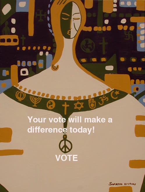
Soraida Martinez, of Puerto Rican heritage, created an entire art movement called Verdadism. Tolerance and diversity sit at the center of her work. Her name has appeared among the most prominent Hispanic artists in the U.S., and she served on the New Jersey State Council of the Arts. Her paintings combine bold lines, vivid colors, and direct social commentary, a combination that translates powerfully to print media.
Martinez proved that printed materials can carry a message without sacrificing visual impact. Her Verdadism pieces use strong outlines and contrasting colors that reproduce beautifully on paper, fabric, and signage. If you are working on large-format print projects that need to communicate something meaningful, a nonprofit campaign, a cultural event poster, or a community initiative, her approach is a masterclass in combining art with advocacy.
Her influence shows up in contemporary print through unapologetic color palettes and message-forward layouts. You do not need to whisper your brand's values. Print them loud. That is a lesson straight from Verdadism.
How Verdadism principles apply to commercial print
Martinez's visual system relies on three things: high contrast, readable compositions, and emotional directness. Those same principles make commercial print materials effective. A postcard with strong contrast gets noticed in a mailbox. A banner with a clear visual hierarchy communicates from fifty feet away. A business card with bold color choices gets kept instead of tossed. The connection between fine-art philosophy and everyday print design is closer than most people realize.
Compare formats
Popular banner formats, side by side
Stock, finish, quantity, turnaround, and from-price across our most-ordered vinyl banners for message-driven displays.
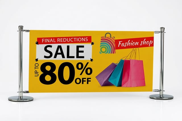 Indoor Banners | 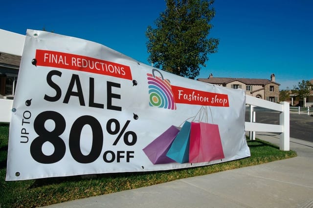 Outdoor Banners | 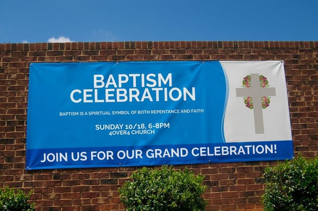 Business Banners | 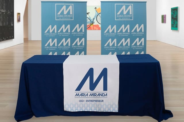 Fabric Banners | |
|---|---|---|---|---|
| Min price | $25.00 | $79.00 | $43.92 | $57.20 |
| Paper / stock | 13oz. Smooth Blockout Vinyl | 13oz. Outdoor Vinyl | 13oz. Scrim Vinyl | 5oz Economy Polyester |
| Size | 12" x 24" | 2' x 4' | 2' x 6' | 24" x 72" |
| Default qty | 1 | 1 | 1 | 1 |
| Turnaround | 2 business days | 3 business days | 2 business days | 4 business days |
| Rating | ||||
| View & customize | View & customize | View & customize | View & customize |
Frank Romero and four decades of murals, color, and cultural print identity
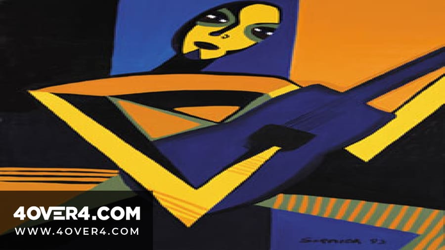
The career of Mexican American muralist Frank Romero spans more than four decades. During the 1970s he gained recognition as part of Los Four, a Chicano art collective that earned an exhibition at the Los Angeles County Museum of Art. His murals have been displayed across Los Angeles, other U.S. cities, Europe, and Japan, a reach most print designers can only dream about.
Beyond his large-scale murals, Romero creates smaller works with vivid colors and detailed compositions. He draws from his Mexican heritage, weaving Aztec and Mayan symbols into his art. Those cultural motifs have become a visual shorthand in print design, showing up in restaurant branding, event flyers, and packaging for products that want to connect with Latino identity and heritage.
Romero's work frequently addresses issues affecting the Latino community, including immigration, cultural identity, and environmental justice. His art captures both the struggles and triumphs of the Chicano experience. For print designers, his career proves that the most memorable work comes from authentic cultural connection, not from following trends. Browse more graphic design portfolio examples to see how contemporary designers channel that same authenticity.
Throughout his career Romero has received numerous awards, and he continues to advocate for social change through art. With a body of work spanning over forty years, his legacy keeps inspiring new generations of print designers who understand that design without identity is just decoration.
Banner specs
Double-sided banners for cultural events
Stocks, grommets, hems, and finishing for the 2-sided blockout banners that carry bold, mural-scale artwork.

Lee Quinones, from subway tunnels to gallery walls
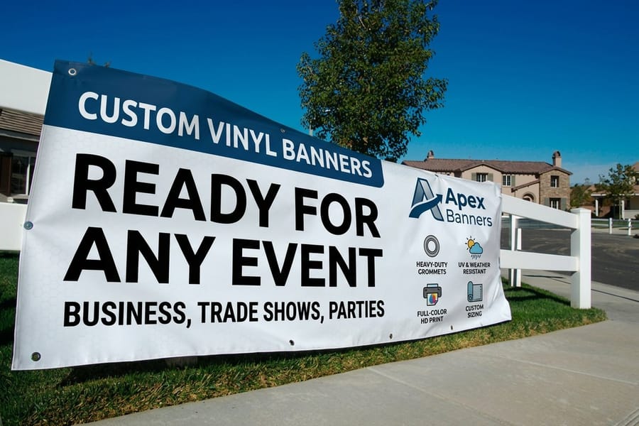
Puerto Rican artist Lee Quinones first gained attention as part of the New York City graffiti movement. His work carried political messages and made its way from subway tunnels to exhibitions at the Whitney Museum of American Art and the Museum of the City of New York. He has been featured in multiple street-art documentaries, cementing his place in both art history and design culture.
Quinones helped legitimize an entire visual language. Graffiti lettering, spray-paint textures, and layered compositions now appear in everything from concert posters to product packaging to 2 Sided Blockout Banners. The raw energy of street art translates to print in ways that feel immediate and authentic. When a brand wants to look edgy without being corporate, it is borrowing from the playbook Quinones helped write.
Street art and its lasting impact on print typography
The hand-lettering and custom typography that came out of the graffiti movement did not stay on walls. It moved to paper, to screens, and back to paper again. Many of today's most popular display fonts carry DNA from artists like Quinones. If you are designing print materials that need personality, think event flyers, band merch, or youth-focused campaigns, that lineage matters. The boldness, the imperfection, and the human touch all started on subway cars in the Bronx.
Street-level display
A-frame signs for bold graphics
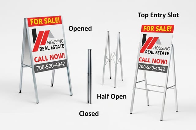
Put edgy, hand-lettered artwork at eye level on the sidewalk with a durable, double-sided aluminum A-frame.
Alejandro Magallanes and Mexican poster design that reshaped the medium
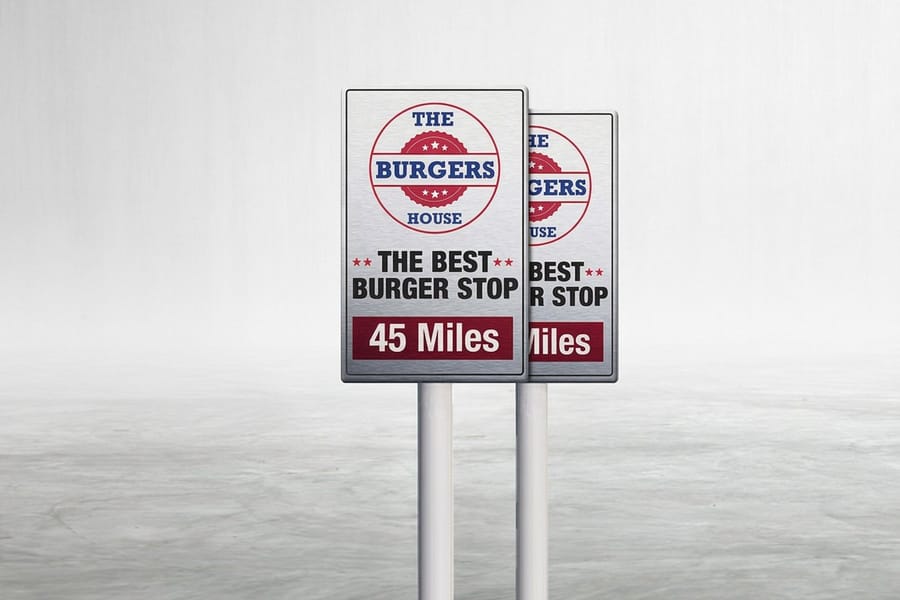
Alejandro Magallanes is a Mexican graphic designer whose artwork has been displayed in galleries across many countries. He has received prestigious honors, and his posters and book illustrations carry a style that is instantly recognizable, playful, layered, and deeply rooted in Mexican visual culture.
His work incorporates vivid colors, detailed patterns, and bold typography. He draws from Mexican history, folklore, and everyday life, using traditional motifs in ways that feel contemporary rather than nostalgic. That balance between heritage and modernity is exactly what makes Latino designers print design influence so valuable to the broader design world. It is not about looking backward. It is about carrying something forward. For anyone exploring printing articles on design inspiration, his body of work is a goldmine.
What Magallanes teaches about print composition
Look at any Magallanes poster and you will notice something. Every element has a reason to be there. Nothing is filler. His compositions use negative space as deliberately as they use color. For print designers, that is a practical lesson. Whether you are laying out a business card or a large-format sign, every square inch of paper costs money, so make it count. Magallanes proves that restraint and boldness are not opposites. They are partners.
Compare formats
Popular poster formats, side by side
Stock, finish, quantity, turnaround, and from-price across our most-ordered posters for design-led work.
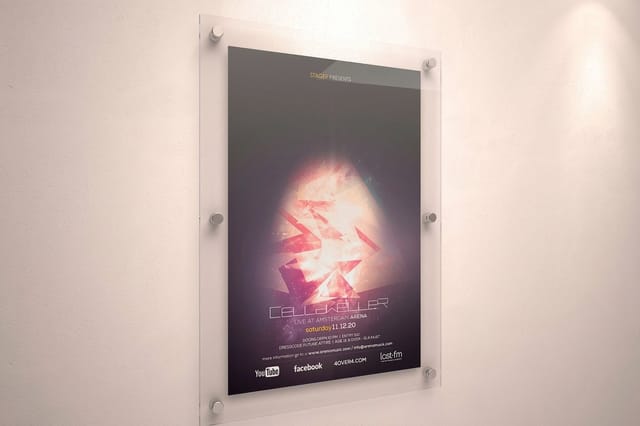 Large Format Posters |  Standard Posters | 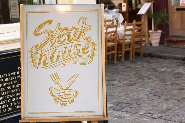 Dry Erase Posters | 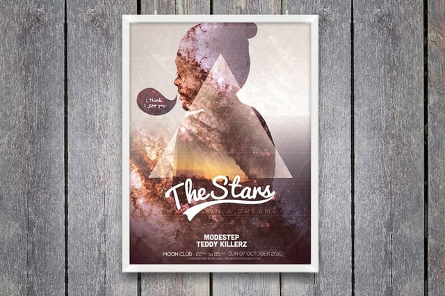 Mounted Posters | |
|---|---|---|---|---|
| Min price | $25.00 | $108.75 | $29.00 | $39.99 |
| Paper / stock | 10mil Semi Gloss | 100# Gloss Text | Dry Erase Face/ Adhesive Vinyl Backer | 10.4 mil Semi Gloss |
| Finish | - | Standard Finish | - | - |
| Size | 11" x 17" | 11" x 17" | 11" x 17" | 8" x 10" |
| Default qty | 1 | 50 | 1 | 1 |
| Turnaround | 2 business days | 5 business days | 4 business days | 4 business days |
| Rating | ||||
| View & customize | View & customize | View & customize | View & customize |
More Hispanic and Latino graphic designers who shaped the printed page
The names above are the ones most people meet first. The field is wider than that, and three more designers explain how Hispanic and Latino graphic designers shaped what a printed page actually looks like. A book cover, a political poster and a picture book are three different problems, and each of these three solved one of them in a way the rest of the industry has been borrowing from ever since.
Vicente Rojo and the Mexican book cover
Vicente Rojo was born in Barcelona and built his career in Mexico, where he spent decades designing books, literary magazines and cultural supplements, and helped found a Mexican literary press. His covers treated type as shape: a few blocks of color, one geometric mark, the title set with room to breathe. He designed them as a system rather than one at a time, so a shelf of them reads as a family.
That is the most transferable idea on this page for anyone printing more than one piece. Give your business cards, your postcards and your folder the same grid, the same two colors and the same type, and the set does the persuading that no single piece can do alone.
Felix Beltran and the poster as a single symbol
Felix Beltran is a Cuban graphic designer whose posters and identity work from the 1960s and 1970s stripped a message down to one flat shape on one flat color. No photography, no gradient, no second idea competing for the eye. He later taught design in Mexico, and generations of poster designers across Latin America learned that discipline from him.
Print that has to work at a distance follows his rule or fails. A yard sign, a trade-show panel or a window poster gets one symbol and one line, because a viewer walking past gives it about a second and a half.
Rafael Lopez and illustration that carries a brand
Rafael Lopez is a Mexican-born illustrator and muralist working in the United States, known for warm, saturated palettes and figures drawn with a folk-art directness. His work moves between picture books and painted walls, which is a useful pairing: both have to read to a child at arm's length and to an adult across a room.
The lesson for print buyers is that commissioned illustration outlasts stock photography. An illustrated postcard or menu belongs to you, cannot be bought by a competitor, and prints cleanly in flat color on any stock you choose.
The canvas for the work
Bold posters, printed sharp
Turn a color-forward, culturally rich design into a full-color poster on the stock and finish of your choice.
Hispanic and Latino graphic designers working now
The influence is not history. Two designers working today show where it has gone next, one into the letterforms themselves and one into identity systems built for a world where the same mark has to survive on a sticker and on a wall.
Gabriel Martinez Meave and type with an accent
Gabriel Martinez Meave is a Mexican type designer whose typefaces draw on Spanish colonial lettering and the Mexican calligraphic tradition rather than on the Swiss models most type revivals lean on. His letterforms carry that origin in the shape of a terminal or the swell of a stroke, without ever becoming costume.
Type is where cultural voice lives on a printed piece. A business card set in a face with that kind of history says something before anyone reads a word of it, and it costs no more to print than a default sans serif.
Rafael Esquer and marks built to survive any size
Rafael Esquer is a Mexican-born designer working in New York, whose studio work is built from bold silhouettes and repeating pattern. The marks are cut from solid shape, which means they hold together at any scale and reproduce as cleanly in one color as in four.
Test your own mark the same way. Print it at sticker size and at poster size on the same sheet. If the small one fills in and the large one looks thin, the artwork is not finished yet, and the press will show you that long before your customers do.
Street-level display
A-frame signs for bold graphics
Put edgy, hand-lettered artwork at eye level on the sidewalk with a durable, double-sided aluminum A-frame.
The broader ripple effect of Latino design on print culture
These individual artists represent something bigger than their own portfolios. Latino designers have collectively reshaped how the print industry thinks about color, typography, cultural storytelling, and the relationship between art and commerce. Walk into any design studio in 2026 and you will see the fingerprints of this influence on mood boards, color palettes, and layout approaches.
The print industry itself has responded. Demand for bright, culturally rich materials has grown alongside the U.S. Hispanic population. Brands targeting multicultural audiences need designers who understand these visual traditions, not as an aesthetic trend but as a lived experience. 4OVER4.COM supports this creative community with green printing options and a wide range of paper stocks that do justice to bold, color-intensive designs.
Consider how these principles show up in everyday products. Restaurant menus with hand-drawn illustration and warm palettes. Event posters with layered typography that feels both modern and rooted. Business cards with textured stocks and saturated inks. This is the practical side of Latino designers print design influence. It is not abstract, it shows up in the materials people hold in their hands.
Color philosophy in Latino-influenced print design
If there is one through-line connecting every designer on this list, it is a fearless relationship with color. Where mainstream Western design often defaults to minimalism and muted palettes, Latino design traditions use saturation, contrast, and warmth. Think terracotta, deep turquoise, marigold yellow, and rich magenta. These are not random choices. They carry cultural meaning rooted in centuries of textile, ceramic, and mural traditions.
For print this matters technically as well as aesthetically. Bold colors need quality paper stocks and precise ink coverage to reproduce well. A design inspired by Cruz-Diez's color interactions will look muddy on cheap paper, so it needs the right substrate to sing. If you want to understand how vivid work holds up on premium material, read what canvas prints are and how they are made.
Typography and hand-lettering traditions
Latino print design has a rich tradition of hand-lettering that predates the digital font revolution. From Mexican loteria cards to Cuban poster art to Puerto Rican signage, hand-drawn type carries personality that digital fonts struggle to replicate. That tradition directly influenced the current boom in custom lettering for branding and print.
Designers like Quinones brought this sensibility from walls to paper, and Magallanes refined it into a sophisticated poster language. Today, brands that want their print materials to feel human and distinctive often turn to hand-lettered elements, a direct lineage from Latino design traditions. Even if you use digital tools, understanding this history helps you make better typographic choices for your next project.
Color that lasts
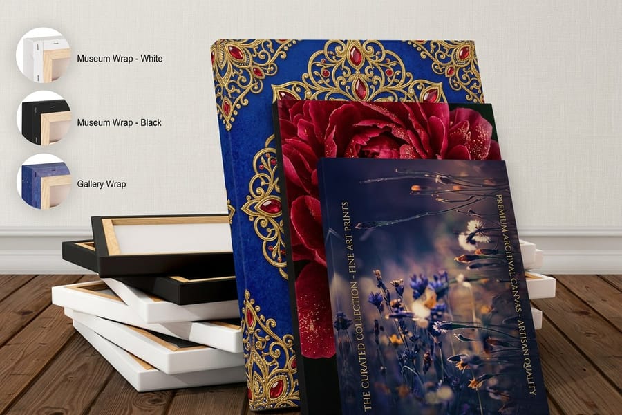
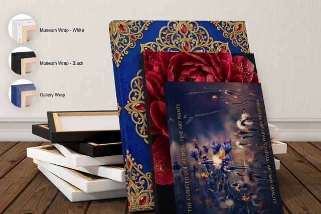
Premium canvas prints
Gallery-grade canvas holds saturated, culturally rich palettes with the depth that celebrates color on paper cannot match.
Bringing this influence into your own print work
You do not need to be Latino to learn from these designers. Their contributions belong to the broader visual culture, and applying their principles can make your print materials stronger. Here are practical ways to channel this influence into your next project.
- Use color with intention. Do not default to safe palettes. Study how Cruz-Diez and Romero use color as a structural element, not just decoration.
- Let your message lead. Martinez's Verdadism proves that the strongest designs start with something to say. Figure out your message first, then design around it.
- Lean into cultural specificity. Generic design is forgettable. Magallanes succeeds because his work is unmistakably Mexican. Whatever your background, lean into it.
- Mix handmade and digital. The tension between hand-drawn elements and clean digital production creates visual interest that pure digital cannot match.
- Think about the substrate. Bold designs need quality materials. A vivid poster on flimsy paper undermines the design, so choose stocks that support your vision.
For large-format applications of culturally inspired designs, Aluminum A-Frames offer a durable way to display bold graphics in high-traffic areas. And for print advertising that channels the wit and visual punch of these designers, browse these funny print ad examples that prove print does not have to be boring.
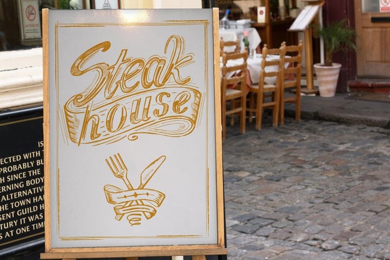
Start fast
Blank templates to start from
Blank press-ready templates keep your artwork aligned to the cut lines and bleed areas from the first draft.

Why this matters for the print you buy today
The story of Latino designers print design influence is not a history lesson. It is a living, evolving force that shapes what gets printed today and what will get printed tomorrow. These seven artists represent just a fraction of the talent within the Latino design community, and the more you explore their work, the more you will see their influence everywhere, in the posters on your wall, the cards in your wallet, and the signs on your street.
When you bring that energy to your own materials, print quality becomes the difference between a design that sings and one that falls flat. Choose the right stock, set your files in CMYK at 300 DPI, and give saturated color the substrate it deserves. For more creative and print-related guidance, explore the full library of printing articles on the 4OVER4.COM blog.
Wally celebrates color on paper
Bold palettes, hand-lettered type, and cultural storytelling, printed sharp
Latino design traditions treat color as a strategy, not a decoration. Lead with your message, lean into cultural specificity, and mix hand-drawn type with clean layout. Then give it a premium substrate so saturated palettes reproduce cleanly, and 4OVER4.COM prints your posters, banners, and signs with the color depth the work deserves.
Print bold posters →What to remember about Latino print design influence
What makes color-forward print work
- High contrast. Strong contrast between figure and background keeps a design readable at a distance, on a shelf, in a mailbox, or across a room.
- Saturated palettes. Deliberate, warm color choices carry cultural meaning and make print pieces feel alive rather than corporate.
- Cultural motifs. Aztec, Mayan, and folk patterns add depth and specificity that generic stock graphics can never provide.
- Hand-lettered type. Custom lettering brings personality and a human touch that digital fonts struggle to replicate.
- Negative space. Intentional breathing room guides the eye and lets bold color and type do their work without clutter.
- Message-first layouts. Leading with a clear idea, then designing around it, keeps the piece purposeful and memorable.
- Premium substrates. Heavy, quality stocks with precise ink coverage let saturated designs reproduce cleanly and last outdoors.
- Format flexibility. The same visual language scales from a business card to a banner to a sign without losing impact.
Explore more
More ways to print bold, cultural design
The cards below open the poster, banner, and canvas formats these palettes print on.
 Article Graphic Design Blogs Worth Following for Print and Branding Ideas Graphic design blogs worth following for print and branding ideas, with what each one covers, how often it pos
  Product Standard Posters Bold, full-color posters from $108.75.
 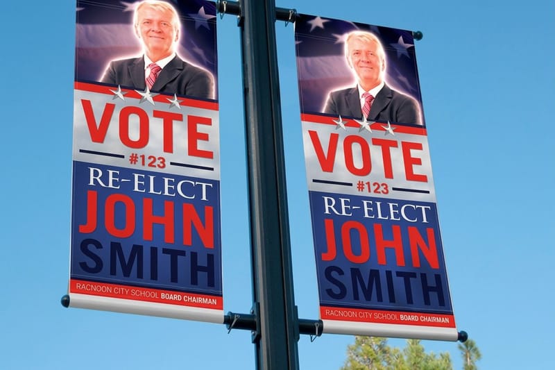 Product 2 Sided Blockout Banners Double-sided event banners from $108.75.
 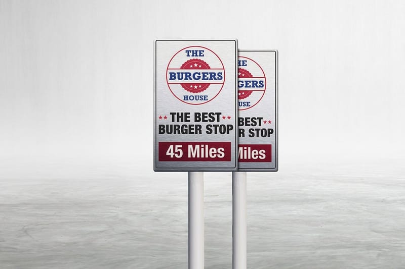 Product Custom Aluminum Signs Durable signage for bold, cultural designs.
 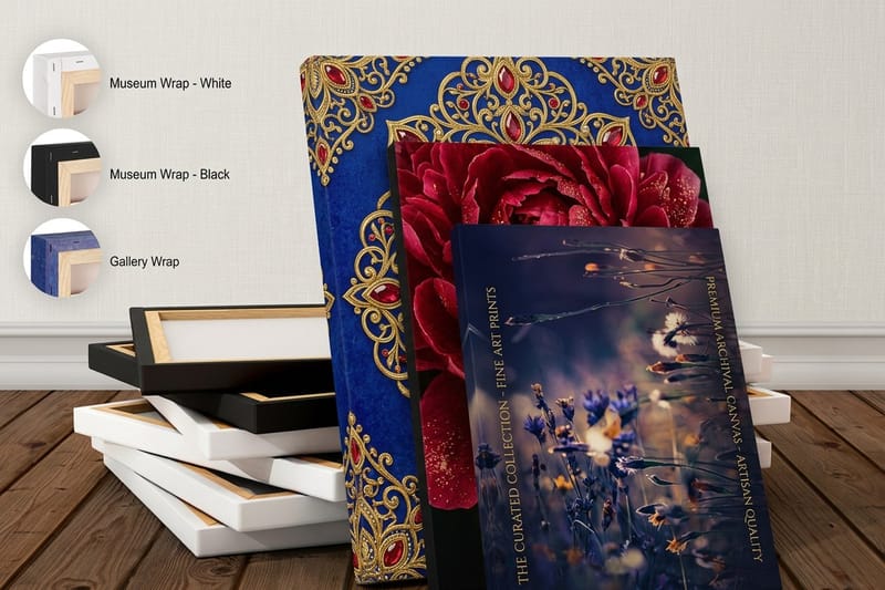 Product Premium Canvas Prints Gallery-grade canvas that holds saturated color.
 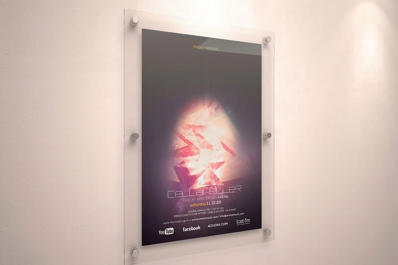 Category Posters Printing Every poster format for design-led work.
 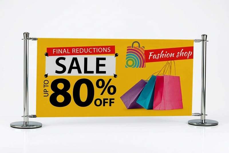 Category Vinyl Banners Printing Large-format banners for events and campaigns. Hub Signs & Banners The full signs and banners hub in one place. Category Large Format Printing Big, bold print for murals-scale ideas.
  Article Graphic Design Portfolios How designers channel authentic style.
  Article Amazing Business Card Design Design inspiration for standout cards.
  Article Funny Print Ad Examples Proof that print does not have to be boring.
 Ready to print design that celebrates color?
Lead with your message, lean into cultural specificity, pick a premium stock, and 4OVER4.COM prints it sharp, as fast as same day.
Common questions about Latino print design influence
How do I borrow from these designers without flattening the work?
Start by studying the color palettes and composition techniques of artists like Cruz-Diez and Magallanes. Use bold, saturated colors with cultural intention rather than defaulting to safe neutrals. Pair hand-drawn typographic elements with clean layouts. Choose quality print substrates, like a heavy card stock or a premium canvas print, that reproduce vivid colors accurately. Let your message drive the design, not the other way around.
Which of these designers fits the job I am designing for?
Match the designer's style to your purpose. For color-forward, optical designs, look to Cruz-Diez's kinetic principles. For message-driven campaigns or nonprofit work, study Martinez's Verdadism approach. For street-level energy and bold typography, Quinones and the graffiti tradition fit best. For poster and editorial layouts, Magallanes offers a refined starting point. The right influence depends on your audience and goals.
Why does this work hold attention on a printed piece?
Latino design traditions prioritize emotional impact, bold visual storytelling, and cultural authenticity, which make marketing materials more memorable. Print pieces that use vivid color, strong composition, and genuine cultural references stand out in mailboxes, on shelves, and at events. Brands targeting multicultural audiences especially benefit, since it signals respect rather than generic outreach. Products like Custom Aluminum Signs work well for displaying culturally rich designs in commercial spaces.
What does saturated color cost me in paper and ink?
Budget depends on scope, but expect to invest more in quality substrates and color accuracy. Bold, saturated designs need premium paper stocks and high-quality ink coverage to look right, so cutting corners on materials undermines the design. For small runs like business cards or postcards, allocate extra for heavier stocks and specialty finishes. For large-format pieces like banners or signs, factor in durable materials that hold color outdoors. The design investment is wasted if the print quality does not match.
