
Retro Font Design Examples for Vintage Charm


Retro font design examples that still work in 2026
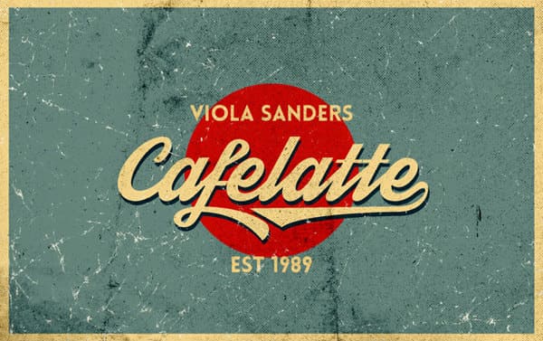
Retro font design means type drawn in the visual language of one decade, and you can spot it in three signals: the weight, the spacing, and a curve or serif shape that stopped being drawn once its era ended. The examples below pull from decades of typographic history, the 1950s diner script, 1970s funk, Wild West slab serifs, and the neon display faces of the 1980s. They are not only nostalgic, they are strategic. The right retro typeface can make a brand feel established, trustworthy, and cool all at once. 4OVER4.COM has printed 10 billion+ cards and marketing pieces since 1999, and retro styled designs land among the most eye catching work that comes through the press.
Whether you are laying out business cards, posters, packaging, or event signage, the font you choose sets the mood before anyone reads a single word. So we gathered this collection of real retro typefaces you can use right now, sorted by era, style, and best use case. For more creative direction, browse the full library of printing articles for design tips across every print format.
What makes a font retro in the first place
Print it
Business cards with vintage type
Standard business cards on 60+ paper stocks, the classic home for a retro wordmark.
A retro font borrows visual cues from a specific past era. Think thick slab serifs from the 1800s, rounded groovy letterforms from the 1960s and 70s, or the pixelated blocky text of the early digital age. The defining trait is simple. It triggers a time specific feeling the moment you see it.
Retro does not mean outdated. Modern designers remix these historical styles with cleaner lines, better kerning, and expanded character sets, so the typefaces feel familiar yet fresh. That tension between old and new is exactly what makes retro font design examples so effective in branding.
One thing separates a good retro font from a gimmicky one, and that is readability. The best retro typefaces hold their legibility at multiple sizes while still delivering the nostalgic punch. If your audience cannot read the flyer or the business card, the coolest font in the world will not save you. For the fine print, our business card font size guide covers the numbers that keep type legible.
Nineteen seventies display fonts, from funk to clean geometric
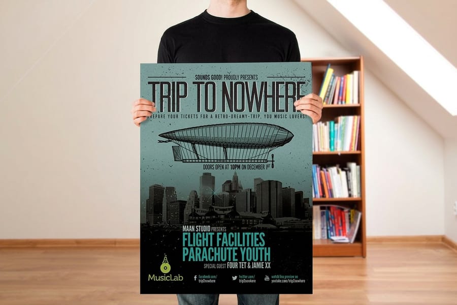
Display type is where retro really shows off. These faces are built for headlines, poster titles, and packaging, the big moments where your type has room to breathe.
Coolvetica, 1970s funk and disco
Coolvetica is a scratch built sans serif that recreates the curvy, casual letterforms of 1970s advertising. Those funky curls and relaxed spacing make it perfect for headlines, poster titles, and packaging where you want a laid back retro vibe without going full psychedelic.
Display fonts like Coolvetica work best at large sizes. Use them on event flyers, menu boards, or the front of a greeting card, then pair them with a clean sans serif for body text. If you need greeting card inspiration, these greeting card options show how one typographic choice can transform a simple card.
Franchise, clean mid century display
Franchise is a display typeface built for speed. Its characters are uniform, stylish, and designed to communicate quickly, whether that is on a printed poster, a web banner, or a business card. The clean geometric structure gives it a mid century modern feel that travels across industries.
What makes Franchise stand out among retro font design examples is its dual purpose nature. It reads well on screen and in print, and that consistency matters when your branding needs to look identical on your website, your social feed, and your printed materials.
Script and Western type with real personality
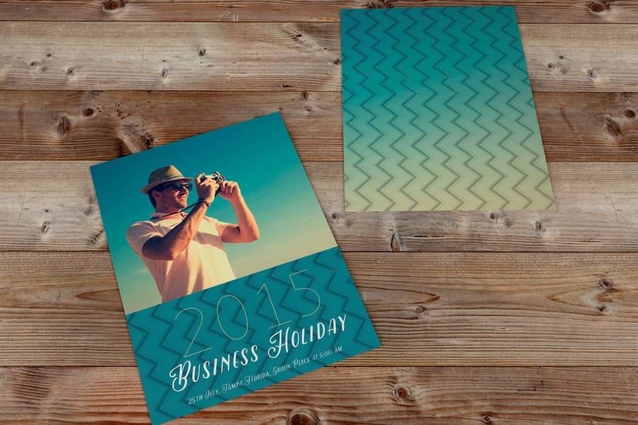
Some retro fonts carry personality in every stroke. Script and Western faces bring a warmth and grit that geometric type cannot fake.
Lobster, connected retro script
Lobster is an OpenType font with multiple versions of each letter, so characters connect naturally with their neighbors. The result looks hand lettered and organic, like someone with beautiful penmanship wrote your brand name on a chalkboard.
Script fonts like Lobster show up everywhere in food and beverage branding, wedding invitations, and boutique retail. They carry a warmth geometric sans serifs cannot replicate, so use them for a logo or headline, never for whole paragraphs. Planning invitations? Our wedding invitation font guide pairs scripts with the right supporting type.
Brownwood and Chunk, Western and woodcut
Brownwood brings a dusty country and cowboy aesthetic into your designs, ideal for barbecue joints, craft breweries, and outdoor brands. Printed on textured or kraft paper the rustic effect gets even more convincing, which is why artisan food labels and small batch spirits lean on it.
Chunk pushes the Western theme further with ultra bold slab serif letterforms inspired by old American woodcut type, the kind you would see on wanted posters and saloon signs. This fat block lettering demands attention, so it shines on event posters, album covers, and bold business card designs. For more ideas, browse these amazing business card designs.
Bold script and hand lettered signage
Print it
Banners built for bold type
Outdoor banners give sweeping retro scripts and signage lettering room to command a space.
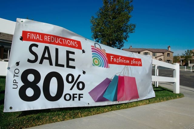
Signage type wants to be seen from across the street. These faces revive the energy of painted shopfronts and 1970s fashion branding.
Streetwear, 1960s and 70s fashion script
Streetwear is a script typeface built for logos, posters, packaging, t shirts, and branding. Its bold, sweeping strokes bring back the stylish energy of 1960s and 1970s fashion typography. It is confident without being aggressive, the typographic equivalent of a leather jacket and sunglasses.
Streetwear style retro fonts stay popular in apparel branding, music design, and lifestyle marketing. They photograph well on merchandise and look striking on promotional pieces. Imagine this font on a custom mug, a tote bag, or even 3D lenticular posters for a display that shifts as you move past it.
Hand Shop Typography C30, painted signboards
Hand Shop Typography C30 captures the feel of hand painted shop signboards from decades past, when owners hired sign painters to craft eye catching storefronts. This font recreates that artisan quality with modern digital precision.
The hand made feel makes it a strong choice for artisan brands, coffee shops, and boutique retailers. It ships with banners and ornamental elements, extra assets that save hours when you build a full brand identity, and the vintage character translates beautifully to thicker card stocks.
Condensed slab serifs and minimalist retro
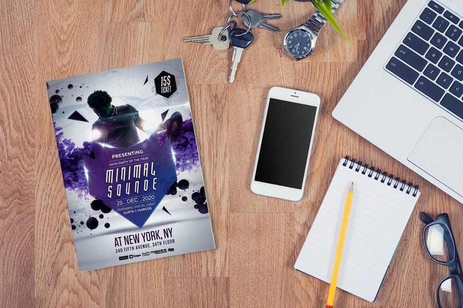
Not every retro font shouts. Some work hard at small sizes, and others whisper the era with restraint.
Geared, condensed slab with grunge
Geared draws from condensed slab serif traditions and comes in four weights, thin, regular, bold, and extra bold. The extensive character set makes it genuinely versatile, and the slightly grungy texture gives it an industrial, workshop quality that suits craft and maker brands.
Slab serifs like Geared hold up on printed materials because the thick serifs stay readable at smaller sizes. Business cards, hang tags, and product labels all benefit. If you are exploring promotional print, these logo sticker design ideas show how bold typography and sticker formats work together.
Blanch, minimalist mid century
Blanch takes a stripped down approach to retro typography. It is clean, geometric, and works across multiple weights, giving you flexibility for headlines, subheadings, and accent text within one family. The tall, narrow letterforms feel mid century without the clutter.
Minimalist retro fonts like Blanch suit tech startups, modern restaurants, and lifestyle brands that want to feel established but not old fashioned. For the roots of that restraint, our Arial versus Helvetica history traces how mid century type still shapes design today.
Retro font design examples in print advertising
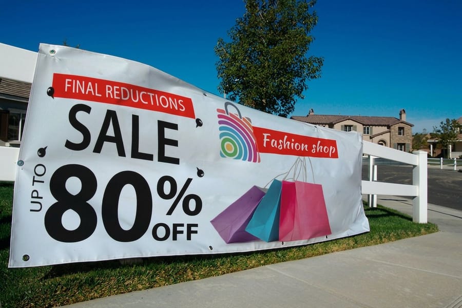
Retro fonts have a long history in print advertising, and they still work. The nostalgia factor creates an emotional connection that clean minimalist fonts sometimes cannot reach. When a viewer sees a 1970s style script on a poster, they do not just read the words, they feel something.
That response is what makes retro typography so powerful in marketing. Postcards, flyers, banners, and direct mail all gain warmth and personality from it. For a look at how humor and typography work together, check out these funny print ad examples. With over 150,000+ businesses trusting 4OVER4.COM, retro styled designs stay a favorite that stands out in mailboxes and at trade shows.
How to choose the right retro font for your project
Not every retro font works for every project. Here is how to narrow it down.
- Match the era to your brand personality. A 1950s diner font says something completely different than a 1980s neon display face. Pick the decade that fits your brand story.
- Test readability at your actual print size. A font that looks amazing on a poster can fall apart on a business card, so always proof at the final dimensions.
- Limit yourself to two fonts maximum. One retro display font for headlines, one clean font for body text. More than two creates visual chaos.
- Check the character set. Some free retro fonts lack the special characters, numbers, or punctuation you will need. Verify before you commit.
- Consider the print substrate. Textured papers boost the vintage feel, while glossy finishes can make retro fonts feel oddly modern. Match the paper to the type.
If you are building a portfolio around retro typography, these graphic design portfolio examples show how to present typographic projects effectively.
Pairing retro fonts with modern design elements
The most effective retro font design examples never sit in a vacuum. They pair with complementary elements that create balance.
- Retro font plus minimalist layout. Let the typography be the star and keep everything else clean and simple.
- Retro font plus vintage color palette. Muted earth tones, mustard yellows, burnt oranges, and olive greens boost the nostalgic effect.
- Retro font plus modern photography. The contrast between old school type and crisp contemporary photos creates visual tension that grabs attention.
- Retro font plus textured backgrounds. Paper grain, subtle noise, and worn edges make retro typography feel authentic rather than costume like.
When you are ready to see these fonts on real stock, 4OVER4.COM offers free samples so you can feel the paper quality and judge how your retro type translates from screen to print.
Getting your retro designs printed right
Designing with retro fonts is only half the equation. Printing them well is the other half. Convert all fonts to outlines before you send files to print. That single step prevents font substitution errors and makes sure your retro typeface prints exactly as you designed it.
Choose the right paper stock. Uncoated and textured papers complement retro typography naturally, and the slight roughness of an uncoated sheet feels authentic alongside vintage letterforms. 4OVER4.COM offers 60+ paper types, from smooth silk to heavy kraft, so you can match the substrate to your type.
Pay attention to ink coverage. Bold retro fonts with thick strokes need more ink, and on lighter stocks heavy coverage can cause show through, so ask about paper weight when your design features large solid areas. Every order is backed by the 4OVER4.COM satisfaction guarantee, and repeat customers earn coins on every order, rewards that add up fast when you print regularly.
Free versus premium retro fonts
Every retro font in this roundup is available free or at low cost, but should you always go free? Not necessarily. Free retro fonts are perfect for personal projects, social graphics, and testing concepts. They give you hundreds of styles with no financial commitment, though the trade off is limited character sets, inconsistent kerning, and sometimes restrictive commercial licenses.
Premium retro fonts usually cost between $15 and $75 for a full family, and what you get is professional kerning, extensive character sets with ligatures and alternates, multiple weights, and clear commercial licensing. For client work and professional branding that investment is almost always worth it. Use free fonts for exploration and mood boards, then switch to premium versions in final production. Need a related read? Our guide on business card design rates breaks down what professional type and layout are worth, and these free font downloads expand your library.
Quantity and price
Business card pricing and specs
Real configurator numbers for standard business cards, the classic home for a retro wordmark. The more you order, the lower the per unit cost.
| Quantity | Price Per Unit | Total |
|---|---|---|
| 100 | 17.6¢ | $17.57 |
| 200 | 11.5¢ | $23.07 |
| 300 | 9.15¢ | $27.46 |
| 400 | 7.96¢ | $31.86 |
| 500 | 7.25¢ | $36.26 |
| 600 | 6.77¢ | $40.64 |

Compare formats
Popular business card formats, side by side
Stock, finish, quantity, turnaround, and from price across the most ordered business cards, so retro type lands on the right stock.
 free business cards |  Standard Business Cards |  3D Lenticular Business Cards |  Metallic Foil Business Cards | |
|---|---|---|---|---|
| Min price | Free | $17.57 | $690.88 | $222.13 |
| Paper / stock | 14pt Gloss Cover | 14pt Gloss Cover | 31pt Lenticular Lens | 16 Point Silk Laminated |
| Finish | - | Standard Finish | - | - |
| Size | 2" x 3.5" | 2" x 3.5" | 2" x 3.5" - Vertical | 2" x 3.5" |
| Default qty | 200 | 100 | 500 | 500 |
| Turnaround | 5 business days | 3 business days | 22 business days | 7 business days |
| Rating | ||||
| View & customize | View & customize | View & customize | View & customize |
Start fast
Templates and print ready blanks
Postcard design templates and exact size blanks, so your retro type lands inside the cut line.

Wally picks the right retro font
One display font, one clean body font, printed on the right stock
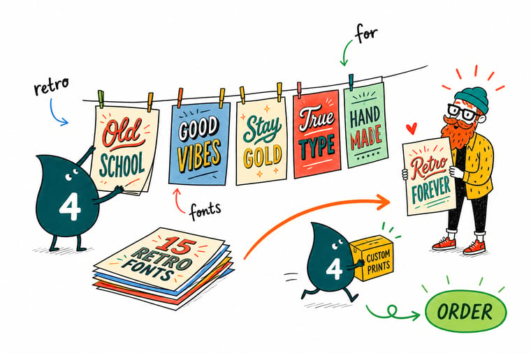
Retro type sets the mood before anyone reads a word. Pick one display face for the headline, pair it with a clean body font, convert everything to outlines, and choose an uncoated or kraft stock to boost the vintage feel. 4OVER4.COM prints it sharp on 60+ papers, so your 1970s script or Western slab lands exactly as you designed it.
Shop business cards →Where to Find Vintage Fonts Worth Downloading
Four kinds of source turn up for vintage type, and they are not interchangeable. Knowing which one you are on saves an hour of downloading and a licensing problem later.
- Free font aggregators. Enormous catalogs, uneven quality. Expect missing characters, no kerning, and demo versions that stop at the capitals.
- Subscription libraries. Fewer faces, all of them complete and cleared for commercial use, usually bundled with software you may already pay for.
- Independent foundries. Where the good revivals live. You buy one family and get the full character set, real alternates, and a licence written down in plain terms.
- Marketplaces. Bundles of display faces sold cheap. Fine for a one off poster, thin for anything you need to set body copy in.
Judge any candidate on three things before you fall for the sample image. Does it have numerals and punctuation, does it carry the accents your names need, and does the licence cover print at the quantity you plan to run.
What to remember about retro font design
Common retro font mistakes to avoid
- Too many retro fonts at once. One is a statement, two is a conversation, three or more is a garage sale. Pick one retro display font and stick with it.
- Ignoring contrast. Retro fonts often carry thick strokes and decorative elements, so a busy background or weak color contrast makes text unreadable. Check your design at arm’s length.
- Forgetting digital accessibility. Some retro fonts are hard to read for people with visual impairments. Test your choices against WCAG guidelines so the design stays accessible.
- Choosing style over substance. A beautiful retro font that clashes with your brand personality will confuse your audience. The font should reinforce your message, not distract from it.
Explore more
More ways to design and print with retro type
Every related page type on 4OVER4.COM, one card each, so you can keep exploring retro typography and print.
 Product Standard Business Cards The classic home for a retro wordmark, from $17.57.
  Product Standard Posters A big canvas for display type and poster titles.
  Hub Posters and Wall Art Every poster and wall display format in one place.
  Product Standard Postcards Retro direct mail that stands out in the box, from $16.48.
 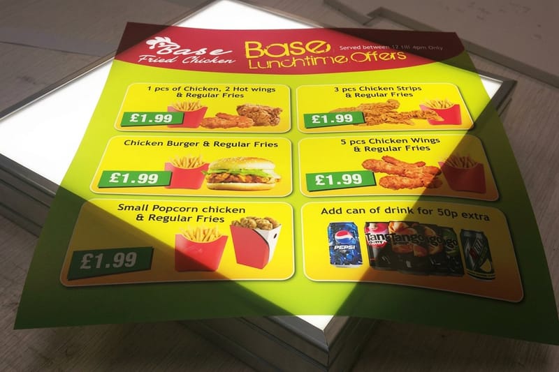 Article Business Card Font Size Guide The type sizes that keep retro fonts legible.
 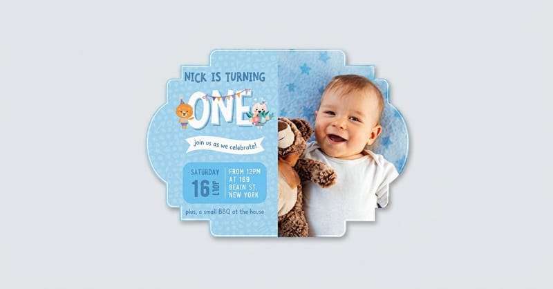 Article Wedding Invitation Font Guide Pair retro scripts with the right supporting type.
  Article Amazing Business Card Designs Bold typography inspiration for your cards.
 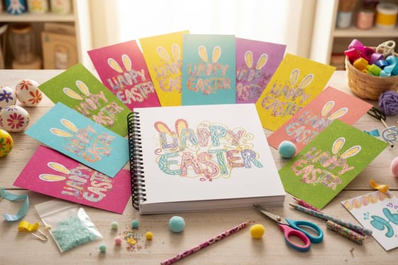 Article Free Font Downloads More free type to expand your library.
  Article Arial vs Helvetica History How mid century type still shapes design today.
  Guide Printing Guides Quick answers across every print product.
 Ready to print your retro design?
Pick a display font, pair it with a clean body face, and 4OVER4.COM prints it sharp on 60+ paper stocks, as fast as same day.
How to Age a Modern Typeface
Sometimes the face you want does not exist, or the one that does will not licence for what you are printing. A clean modern typeface can be pushed backwards with three moves, none of which needs a new font.
Tighten the spacing first. Mid century display type was set far closer than any default digital face, and pulling the letters together does more for the period feel than any texture ever will.
Then add the press, not the dirt. Real vintage printing shows slightly thickened strokes where ink spread into paper, softened corners, and two colors that sit next to each other imperfectly. A light roughen on the outline plus a fractional offset between two inks reads as letterpress. Heavy grunge texture just reads as a filter.
Finish on the paper. An uncoated or kraft stock absorbs ink the way old stock did and does half the work for you, which is why the same file looks modern on gloss and forty years old on uncoated.
Common questions about retro typography
What is the best font for vintage style?
There is no single best one, because vintage covers about eighty years of very different type. A 1950s diner look wants a bouncing brush script, a 1970s look wants a heavy rounded geometric, and a Western look wants a slab serif with heavy brackets. Pick the decade that matches your brand first and the face second, because choosing a font before choosing an era is how a design ends up looking generically old rather than specifically from somewhere.
What is Gen Z's favorite font?
There is no single answer, but the type doing well with younger audiences right now leans on heavy grotesques, chrome effects and bubble letterforms from the late nineties and early 2000s rather than the mid century faces most retro lists cover. That is still nostalgia, just for a different decade. If you are designing for that audience, treat Y2K as its own era with its own rules instead of assuming all vintage type reads the same way.
What font goes well with vintage goods?
Pair one vintage display face with one quiet workhorse and stop there. A period script or slab carries the name and the headline, then a plain grotesque or a simple old style serif handles prices, ingredients, sizes and everything a customer has to actually read. That contrast is what makes the vintage face look chosen rather than applied to everything, and it keeps small type legible on a label where a decorative face would close up.
What are some vintage lettering fonts?
Vintage lettering usually means one of four shapes: a connected brush script from signwriting, a condensed gothic from posters and tickets, a slab serif from Western and circus printing, and a rounded geometric from the seventies. Hand lettered revivals differ from ordinary fonts in that they carry alternate characters, so the same letter does not repeat identically inside a word. Check for those alternates before you buy, because they are what stops a script looking typed.
What are the best practices for retro font design examples?
Stick to one retro display font per project and pair it with a neutral body font. Always convert text to outlines before sending files to print. Test your retro font design examples at the actual print size, because what looks bold on a monitor can turn muddy on a 3.5 by 2 inch business card. Choose uncoated paper stocks to reinforce the vintage feel, and 4OVER4.COM offers 60+ paper types to match your typographic style. For brainstorming boards and signage drafts, dry erase aluminum panels let you sketch layout concepts before you commit to final prints.
How do I choose the right retro font design examples for my brand?
Start by identifying the decade that matches your brand personality. A 1950s diner script suits food and hospitality brands. A 1970s funk typeface works for music, fashion, and lifestyle companies. Western slab serifs fit craft, artisan, and outdoor brands. Then check the character set to make sure the font includes every letter, number, and symbol your brand materials require.
What makes retro font design examples effective for marketing?
Retro fonts trigger nostalgia, and nostalgia creates emotional connections. People are drawn to designs that feel familiar and warm. In a mailbox full of modern minimalist postcards, a retro styled piece stands out immediately, and that emotional pull translates to higher engagement. With 150,000+ businesses printing through 4OVER4.COM, retro styled marketing materials consistently perform well across industries from food service to real estate.
How much should I budget for retro font design examples?
Many excellent retro fonts are completely free for personal use. For commercial projects, premium retro font families typically cost $15 to $75. The real budget consideration is printing, since quality paper and finishes make retro typography shine. Request samples before ordering in bulk to confirm your font choice looks right on your selected paper stock. For reusable signage featuring retro designs, dry erase coroplast signs offer a durable, budget friendly option for menus and event boards.
